
What Is UX Design? A Clear Definition for Beginners

UX design is the practice of shaping a person’s perceptions and responses to a product, system, or service, based on the ISO 9241-210 standard and the discipline Don Norman named in the 1990s. That definition covers far more than screens. It spans the entire journey someone takes with a company, from the first ad they see to the support ticket they file six months later.
UX designers typically shape:
-
How easy a product is to learn and use on the first try
-
Whether onboarding, error messages, and support touchpoints feel coherent rather than bolted together
A polished interface with a confusing return policy or a broken help center is not good UX. It’s just good UI wearing a costume.
Key Takeaways
UX design means shaping a person’s perceptions and responses across an entire product journey, not just the visual interface, and doing it through repeatable research and testing rather than guesswork.
| Point | Details |
|---|---|
| Formal definition | ISO 9241-210 defines UX as perceptions and responses from use or anticipated use of a product or service. |
| UI is a subset of UX | Visual interface design supports UX but doesn’t replace research, onboarding, or support quality. |
| Process is cyclical | Discover, define, prototype, test, and iterate repeat continuously rather than running once per launch. |
| Principles guide trade-offs | Morville’s honeycomb (useful, usable, findable, credible, desirable, accessible) helps teams prioritize under pressure. |
| Validate with real sessions | Livesession’s session replay and analytics help teams turn a metric drop into a specific, fixable observation. |
Table of Contents
UX Design Definition: What ISO, NN/g, and IxDF Actually Say
The most cited formal definition comes from the International Organization for Standardization, which describes user experience as a person’s perceptions and responses resulting from the use or anticipated use of a product, system, or service. That sentence has two working parts. “Perceptions and responses” points to something internal and psychological, how someone feels, what they notice, whether they trust the thing in front of them. “Use or anticipated use” extends the definition backward in time, meaning UX starts before a person even touches the product. A confusing app store listing or a slow-loading landing page already shapes the experience.
A person’s perceptions and responses that result from the use or anticipated use of a product, system, or service.
That framing matters because it keeps designers from chasing feelings they cannot observe. As the Interaction Design Foundation notes, UX practitioners work with behavior and measurable outcomes, not vague emotional targets. You cannot design “happiness” directly, but you can design a checkout flow that reduces confusion, and confusion is something you can watch happen in a session recording.
Don Norman gets credit for coining the term “user experience” while working at Apple in the 1990s, and the Nielsen Norman Group has spent decades refining what that means in practice. NN/g frames UX as the holistic relationship between a person and everything a company puts in front of them: the product, the marketing, the service interactions, the packaging. It’s a professional discipline now, not just a design sensibility.
The IxDF’s practitioner-facing definition sharpens this further by describing UX design as the process teams use to create products that provide meaningful, relevant experiences to the people who use them. Their framing explicitly folds in branding, usability, and after-sales support, which is why a UX team’s scope often extends well past what shows up on a screen. A few threads run through all three definitions:
-
UX is defined by outcomes for the person, not features of the product
-
The scope includes anticipated use, meaning first impressions count before the first click
-
It’s a discipline with methods and accountability, not a synonym for “nice design”
Where Did UX Design Come From?
UX design grew out of human-computer interaction research and cognitive psychology, fields that were asking how people actually think and behave long before anyone called it “UX.” Don Norman’s move to Apple in 1993 gave the idea a name and a job title, but the underlying ideas, mental models, error prevention, feedback loops, borrowed heavily from ergonomics and information science that predated computers entirely.
A few forces pushed the field to professionalize rather than stay a design footnote:
-
Usability testing became a repeatable practice, giving teams evidence instead of opinion
-
Products stopped being single interfaces and became ecosystems (app, website, support, email), which needed someone thinking across all of it
-
Companies started measuring the cost of bad experiences in churn and support tickets, not just aesthetics complaints
By the 2000s, “UX designer” was a hiring title at major tech companies. By the 2010s, it was a standard department, sitting somewhere between product, engineering, and research.
What Are the Core Components of UX Design?
Ask five UX designers what they do all day and you’ll get five different answers, because the discipline covers a genuinely wide set of activities. The Wikipedia entry on user experience design lists research, information architecture, interaction design, visual design, usability, and accessibility as the core pillars, and that’s a reasonable checklist to start from.
-
Research. This is where most UX work actually begins, and it splits into qualitative methods (interviews, contextual inquiry, usability sessions) and quantitative methods (surveys, analytics, A/B test results). Qualitative research tells you why something is broken; quantitative data tells you how often it happens and to whom.
-
Information architecture. This is the invisible skeleton of a product, the labels, categories, and navigation paths that determine whether someone can find what they need. Bad IA is the reason people give up on a website and just Google the answer instead.
-
Interaction design. This covers the flows and micro-interactions, what happens when someone taps a button, swipes a card, or submits a form. Good interaction design makes the system’s state obvious at every step.
-
Visual design. Hierarchy, contrast, and affordances live here, the visual cues that tell someone what’s clickable, what’s important, and what to ignore. Visual design supports UX; it doesn’t replace it.
-
Usability and accessibility. Usability asks whether people can complete tasks efficiently. Accessibility asks whether that holds true for people using screen readers, keyboard navigation, or assistive technology, and it’s typically measured against standards like WCAG rather than gut feel.
-
Service touchpoints beyond the interface. Onboarding emails, packaging, support chat, even the tone of an error message, these all shape experience and often get missed by teams who think UX means “the app.”
Pro Tip: When you’re stuck on which component to prioritize, ask which one is generating support tickets or drop-off right now. Session data usually points to the answer faster than a design critique does.
UX vs. UI vs. CX: What’s the Actual Difference?
UI design is a subset of UX design, not a synonym for it, a distinction that trips up more beginners than almost anything else in this field. UI covers the visual and interactive surface: buttons, typography, color, layout. UX covers the entire experience surrounding that surface, including whether the product solves the right problem in the first place. As NN/g puts it, treating UX and UI as interchangeable is one of the most common and costly misunderstandings in the industry.
CX, or customer experience, sits one level up from both. It’s the brand-wide journey, marketing emails, sales calls, billing, support, renewal, of which the product’s UX is only one chapter. A great UX inside a product that’s surrounded by a frustrating CX (hard to cancel, slow refunds, unresponsive support) still leaves people unhappy overall.
Here’s where the three concepts actually diverge in a real scenario:
-
A signup flow can have gorgeous UI (clean typography, a slick animated button) and still fail as UX if the confirmation email never arrives or the onboarding tutorial explains nothing.
-
A product can have flawless UX inside the app and still lose the customer over CX failures, like a billing dispute nobody resolves for three weeks.
-
UI is judged by whether it looks and feels right in the moment. UX is judged by whether the person actually accomplished their goal. CX is judged by whether they’d come back.
What Principles Do UX Designers Actually Use?
Most UX evaluation traces back to a short list of heuristics, and Jakob Nielsen’s ten usability heuristics remain the most widely taught starting point. They include things like visibility of system status, user control and freedom, error prevention, and recognition over recall, principles that sound abstract until you apply them to something as ordinary as a delete button that doesn’t ask “are you sure?”
Peter Morville’s UX honeycomb offers a complementary lens, breaking experience quality into six attributes rather than ten rules:
-
Useful – does it solve a real problem worth solving?
-
Usable – can people actually operate it without frustration?
-
Findable – can people locate what they need, inside the product and through search?
-
Credible – do people trust the information and the source?
-
Desirable – does the design evoke the right emotional response?
-
Accessible – does it work for people with a full range of abilities?
The honeycomb is popular precisely because it forces trade-off conversations. A feature can be highly desirable and still fail if it’s not usable, and teams under deadline pressure often default to visual polish (desirability) at the expense of findability or accessibility. Uxcel’s breakdown of the honeycomb is a useful reference for seeing how these attributes interact rather than compete.
The reason these frameworks persist isn’t nostalgia. It’s that practitioner sources like TechTarget consistently emphasize that UX decisions should be evidence driven, not based on aesthetic preference alone, and heuristics give teams a shared, testable vocabulary instead of arguing over taste.
How Does the UX Design Process Actually Work?
Most UX projects follow a version of the same arc: discover, define, ideate, prototype, test, and iterate. Google’s Grow content frames this as discover, define, prototype, and test, a slightly compressed version that still captures the loop most teams run again and again rather than treating as a one-time sequence.
-
Discover. Teams run interviews, surveys, and contextual research to understand what people actually need, as opposed to what stakeholders assume they need.
-
Define. Research gets synthesized into problem statements, personas, or journey maps that the whole team can align around.
-
Ideate. Designers sketch multiple directions rather than committing early to one solution, often through structured brainstorming or competitive analysis.
-
Prototype. Wireframes and interactive prototypes turn ideas into something testable, ranging from paper sketches to clickable Figma files.
-
Test. Usability sessions, first-click tests, and moderated interviews surface where people get confused, click the wrong thing, or abandon the task.
-
Iterate. Findings feed back into design, and the loop restarts, ideally before launch rather than after.
Deliverables at each stage vary by team, but they typically include:
-
Research reports and journey maps reviewed by product managers
-
Wireframes and prototypes reviewed by engineering for feasibility
-
Usability test findings and analytics dashboards reviewed by the whole product team before a launch decision
The strongest teams don’t treat these stages as a straight line. Analytics from a live product will often kick off a fresh discovery phase for one feature while another feature is still in prototyping, and combining qualitative interviews with quantitative signals is what lets teams decide which problems are worth solving first instead of guessing.
What Does a UX Designer Actually Do Day to Day?
A UX designer’s calendar usually mixes research syncs, design critiques, and stakeholder meetings with product and engineering, rather than long uninterrupted stretches of just drawing screens. Early career UX work leans heavily on wireframing and testing; senior UX work leans more on synthesis, prioritization, and persuading a room full of stakeholders that the unglamorous fix matters more than the flashy one.
The skills worth prioritizing, in rough order of how often they get used:
-
Research and synthesis – turning messy interview notes into a clear problem statement
-
Wireframing and prototyping – communicating ideas fast enough to test them before they’re expensive to build
-
Usability testing – running sessions that actually produce useful, unbiased findings
-
Storytelling – presenting findings in a way that changes what engineering builds next, not just what gets nodded at in a meeting
Tool categories worth learning, without locking into one brand too early, include prototyping software for building interactive mockups, design systems for keeping interfaces consistent at scale, user research platforms for running interviews and surveys, and analytics or session replay tools for seeing what people actually do after launch. Learning to collaborate with product managers and engineers matters as much as any individual tool. A beautifully designed flow that engineering can’t ship on schedule helps no one.
How Should Beginners Start Learning UX Design?
The fastest path into UX design runs through fundamentals first, then methods, then tools, then real projects, in that order, not the reverse. Too many beginners start by memorizing software shortcuts before they understand what problem the software is supposed to solve.
-
Learn the fundamentals. Read the ISO framing, Norman’s original writing, and NN/g’s articles until the vocabulary feels natural rather than borrowed.
-
Study the methods. Understand what a usability test actually measures, how a journey map gets built, and why heuristic evaluation exists.
-
Pick up tools. Learn one prototyping tool well enough to test ideas quickly, rather than several tools shallowly.
-
Do hands-on projects. Redesign something broken you use daily. A messy grocery app or a confusing government form makes a better practice project than another invented “meditation app” concept.
-
Build a portfolio around process, not polish. Case studies that show the research question, the constraints, and what changed based on testing outrank pretty final screens with no story behind them.
Good resource types to lean on include NN/g and IxDF articles for grounding, ISO guidance for formal definitions, structured courses for methodology, and real practice projects for the muscle memory no article can substitute for. UX also has a measurable business case worth understanding early. Sites analyzing UX’s role in SEO and organic growth show how usability improvements translate directly into search performance and retention, which is a useful argument to have ready when a stakeholder asks why UX work deserves a budget line.
How Do Teams Validate UX Decisions With Real Data?
Session replay and product analytics answer the questions a survey can’t: where exactly does onboarding friction happen, what are people clicking that isn’t even interactive, and what error sequences repeat across dozens of sessions without anyone filing a support ticket about it. Watching five real sessions of someone struggling through a signup form tells a UX researcher more than a dozen assumptions ever will.
The strongest teams pair the two data types rather than picking one:
-
Quantitative data (a 40% drop-off at a specific step) tells you where to look
-
Qualitative session data shows you why, often revealing something as simple as a button that looks clickable but isn’t
Pro Tip: When a metric looks wrong, watch the sessions before you redesign anything. The fix is often smaller than the redesign you were about to propose.
What Are the Real Challenges in Practicing UX Design?
UX work runs into friction that no framework fully solves. Stakeholder disagreement is constant. A well-run usability test can surface a clear problem, and a executive can still override it based on a hunch or a competitor’s feature list. Resourcing is another persistent gap, plenty of teams want “good UX” without funding the research time it takes to earn it.
Measurement is harder than it looks, too. Usability is observable, but desirability and trust are slippery, and teams often fall back on proxy metrics (time on task, click count) that don’t fully capture whether someone actually had a good experience. Accessibility gets treated as a checklist item added late rather than designed in from the start, which usually means expensive rework.
There’s also a scale problem: what works for ten users in a moderated test doesn’t always hold for a million users with wildly different contexts, devices, and abilities. And UX debt accumulates quietly. Small compromises made under deadline pressure, a confusing label here, a skipped confirmation step there, pile up until the product feels harder to use than anyone intended, with no single person responsible for the drift.
Why UX Skills Compound Faster Than People Expect
The gap between reading about UX and practicing it is bigger than most beginners assume, and it closes faster than expected once you start measuring real outcomes instead of guessing at them. Anyone can learn Nielsen’s heuristics in an afternoon. Recognizing which heuristic actually explains why a specific screen is failing takes repetition against real user behavior, not memorization.
What surprises newcomers most is how often the “obvious” design fix turns out to be wrong once you watch actual sessions. People misuse interfaces in ways no spec anticipates, and that gap between intended use and real use is where UX work earns its keep. Study the frameworks, then go watch real people struggle with real products. Measure what changes when you fix something. That loop, more than any course or certification, is what turns a beginner into someone teams trust with product decisions.
See UX Problems as They Happen With Livesession
Reading about friction points is one thing. Watching them happen in real time is another, and that’s the gap Livesession is built to close for UX and product teams. Instead of guessing why a metric dropped, you can watch session replay footage of the exact moment someone hesitates, misclicks, or abandons a flow, then cross-reference it against heatmaps and conversion funnels to see how widespread the problem actually is.
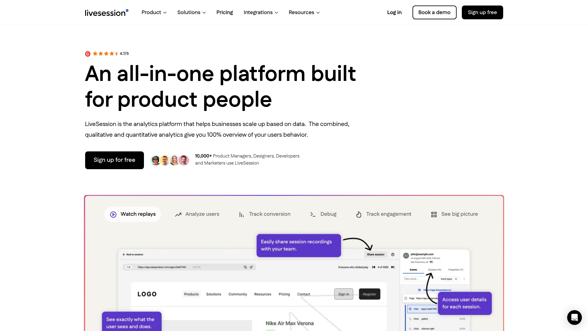
Livesession is built for product managers, designers, developers, and researchers who need to turn a vague hunch (“onboarding feels off”) into a specific, fixable observation. It includes error tracking for catching bugs before support tickets pile up, customizable dashboards for tracking the metrics your team actually cares about, and integrations with tools like Intercom, Zendesk, Shopify, and Segment so session data lives alongside the rest of your workflow. The platform is also built with GDPR and CCPA compliance in mind, which matters if your research involves real user sessions rather than anonymized aggregates.
If you’re trying to validate a UX decision with actual evidence instead of opinion, start a trial with Livesession and watch your first set of real sessions this week.
Frequently Asked Questions
What is the simplest definition of UX design? UX design is the practice of shaping how a person perceives and responds to a product or service, based on the ISO 9241-210 standard, covering everything from first impression to long-term use.
What is the difference between UX design and UI design? UI design covers the visual and interactive surface, buttons, colors, layout, while UX design covers the entire experience surrounding that surface, including whether the product actually solves the person’s problem.
Who came up with the term UX design? Don Norman coined the term “user experience” while working at Apple in the 1990s, and the Nielsen Norman Group has continued shaping how the profession defines the discipline since.
What are the 7 principles of UX design? There’s no single official list, but Peter Morville’s UX honeycomb is the most commonly cited framework, covering useful, usable, findable, credible, desirable, and accessible, sometimes paired with a seventh attribute like valuable depending on the source.
Do I need to know how to code to become a UX designer? No. Coding knowledge helps with collaborating on feasibility, but the core UX skill set centers on research, wireframing, prototyping, and usability testing rather than writing production code.
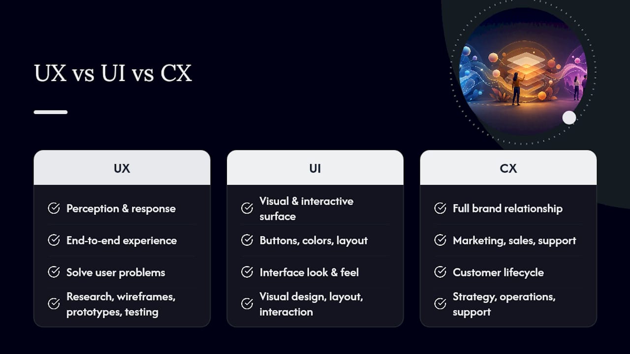
How is UX design different from customer experience (CX)? CX covers the full brand relationship, marketing, sales, billing, support, while UX focuses specifically on the experience within a product or service, making UX one component of the broader CX picture.
Sources
Related articles

Get Started for Free
Join thousands of product people, building products with a sleek combination of qualitative and quantitative data.