
How to define heat maps and what types you can use for your business

Did you know that heat maps were already used in the 1800s? Since then, as technology progressed, these 2D data visualization tools have evolved and are being used in various business areas, including education, digital marketing, and even healthcare and fitness apps.
In this article, we will tackle the question “what is a heat map”, discuss how you use heat map colors to define data, and what the different types of AI-generated heatmaps are. .
Let’s start by looking at the heat map meaning, and how various types of heat map can provide exceptional value to your business.
What is a heat map?
A heat map is a visual representation of data, which displays numeric values as color schemes. It enables brands to monitor and record all actions that visitors perform on a website based on their mouse movements.
If used and interpreted the right way, it can be a data gold mine, and give you incredible insights into customer behavior and enable you to understand your customers better. Heat map analysis can help you detect frustrated users, give insights to improve your conversion rate optimization, enhance your conversion funnel and deliver bespoke customer journey knowledge to product teams.
Now that you know what a heat map is, you are likely wondering – how does it work exactly?
Heat map colors – what do they mean, and how can you use them to your advantage?
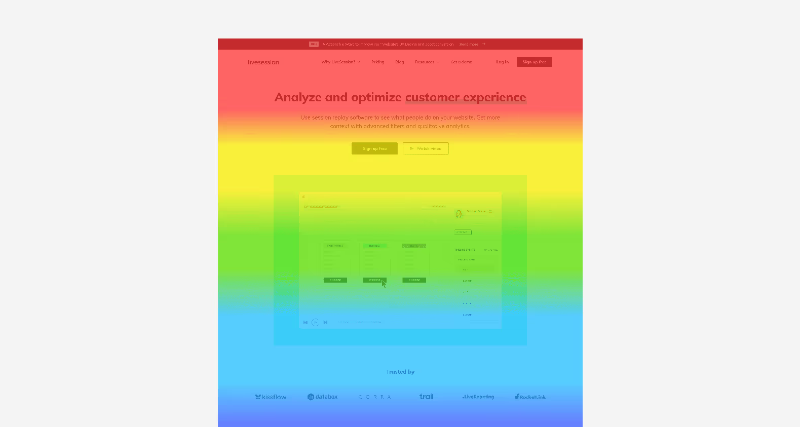
A heat map represents complex data through the use of color. Various color ranges provide the visual interpretation of a user journey. Essentially, it is like a road map of how users navigate your website. It allows you to track mouse cursor and to determine whether users make use of the action button or if they scroll through pages or hover on certain areas.
Let’s take a look at how colors can guide you through interpreting user data.
Hot to cold: see your heat maps as thermostats for engagement!
Typically, a heat map guides your data analysis by indicating areas that are “hot” (which would be your most popular areas and content) and “cold” (which is content that is the least interacted with). Warmer color ranges such as reds and yellows indicate the sections on your website that get the most interactions, while cooler color ranges, such as blues and greens show areas with lesser engagement.

Your heat map color ranges’ cues can be a powerful heat map tool if you need to determine potential reasons for drop-offs in engagement and if you need to assess how your user interface optimization is conducted, or content is performing.
Types of heat maps and how they can help you improve your business
Now that you know what a heat map is, let’s take a look at different heat map examples and their benefits. Here are some heat map examples to consider:
1. Scroll maps
It is no secret that people’s attention spans are getting shorter – according to a study by Digital Information World, it dropped from 12 seconds in the year 2000, to just 8 seconds in 2018. This also means that people spend less time on certain website sections, or even click away or close a screen if they aren’t interested from the get-go.
This is where a scroll heatmap comes in. This heat map example is the ultimate digital heatmap tool for businesses with eCommerce or retail websites, as it shows how far users scroll down your website. For instance, if your heat map indicates that visitors don’t scroll past the fold or midline of your website, you need to ensure that your most valuable content that will hook them is displayed right at the top.
Also, let’s assume, you have a competitively priced product in the top section of your website, such as an air-conditioning unit that has a higher price than other units, but comes with more benefits than most. You need the section of content that explains the advantages of this product to be placed above the fold to ensure users will not miss it if your heat map data indicates that below the fold is where drop-offs happen.
So, interpret your users’ interactions with your website and adjust your content accordingly to ensure success!
2. Click maps
Have you ever wondered how you can track click data on your website? A click map can help you assess this data and make an informed decision on layout changes, supported by your analytics data.
This heat map example indicates via its color cues what your website’s click frequencies are. Blue colors show those areas that are getting fewer clicks, reds signify more clicks, and bright white and yellow is where your users are spending most of their time.
So, how can you use this data to your advantage? If users are, for instance, clicking on certain elements, such as blog or product images that aren’t hyperlinked to other content, consider making them more interactive.
Another example is looking at your top menu bar. Are certain sections getting more clicks than others? Could this be due to the words you use or uncertainty of what a section entails, such as “our work” versus “our clients”? Using your click data can reveal several areas of improvement for your website and enable you to optimize your site’s user experience!

3. Attention maps
This heat map example might sound similar to scrolling maps, but the key difference is that it highlights which sections of your website are getting the most attention from users. It also takes into account how users are navigating your website vertically and horizontally.
For a streaming platform, this can, for instance, indicate if people are viewing certain areas or spending more time on others – which could be a sign of whether an interface needs an update to make content more visible and easier to digest.

4. Move/hover maps
Move or hover map can assist in indicating a user’s mouse movement or hover activity on your website. However, this data is not always concrete. According to research findings byDr Anne Aula, Senior User Experience Researcher at Google, 6% of people showed some vertical correlation between mouse movement and eye-tracking.
Does this mean you should disregard move or hover maps? Not necessarily. There are some benefits to using this heat map, such as observing users across the globe in their natural environment and getting a low-cost solution to track data. However, as a word of caution, consider your data sources as a whole. This will help inform your decisions when it comes to adjusting your website content.
5. Eye-tracking maps
The data for this heat map example is usually gathered in user testing labs where participants’ eye movements are tracked as they navigate your website. These tests typically require tracking devices, but even webcams can be used in these studies.
The benefit of eye-tracking heat maps is that it will not only assist you in determining the areas of your website that got the most attention, but also the time users spent looking at certain content. This will provide insight into where you can improve your offering and help retain users at key points where there might be drop-offs. If you, for instance, have an online learning platform where people are not interacting with your search bar or not hovering for prolonged periods on course content sections, it could indicate that you need to update these sections to drive better conversion rates.

6. Confetti reports
A confetti report is a powerful heat map example with two great benefits: it serves you data of where your website users are clicking and how they navigate your website. The pattern insights that these types of reports provide will help you to improve your website offering and your engagement with your users.
The types of data that you can gather with confetti reports include new and returning visitors (such as frequent buyers returning to an eCommerce shop versus new customers), current campaigns that you are running (such as an online promotion for Valentine’s Day or Black Friday) or even which days of the week visitors are coming to your site, to name a few. You can collect user behavior data from both mobile devices and desktops, which means you will be able to use this data to determine if your website is responsive enough on all platforms.

What is a heat map – final thoughts
Heat maps can provide exceptional value to your business. Heatmapping tools can help you achieve a client-centered approach to the digital content you serve to users – based on their behaviors and preferences. If so far you’ve relied only on Google Analytics in terms of analytics tools, even a basic type of heat map can help you see increase in conversions, lower bounce rate.
Your heat maps will reveal the data and critical elements you need to improve, whether you need better visuals, have more or less contrast on your pages, or need to reshuffle content to help it make more sense to your end-users.
Ultimately, heat mapping can assist in growing your business through a targeted approach that improves your content and delights your visitors, from start to finish.
Frequently asked questions
What is a heat map?
A heat map is a visual representation of data that uses color-coding to display data points on a web page or any other surface. It provides a clear and concise overview of quantitative and qualitative data for data analysis purposes.
What are heat maps used for?
Heat maps are used to visualize complex data, identify patterns, and analyze user behavior on web pages. They are also used by data scientists to track user interactions, such as clicks, mouse tracking, and scrolls.
What is the difference between a heat map and a click map?
Heat maps show population density of user interactions on a web page using color-coding, while click maps show only where users clicked on the web page.
What is a scroll map?
A scroll map is a type of heat map that tracks how far down users scrolled on a web page.
What type of data is shown on a heat map?
Heat maps show numerical data related to user interactions on a web page, such as clicks, scrolls, and mouse tracking.
How do heat maps help with data analysis?
Heat maps help data scientists to quickly and easily analyze user behavior on a web page by providing a visual representation of quantitative and qualitative data.
What are some tools for creating heat maps?
There are many heat map tools available, including Hotjar, Crazy Egg, and Mouseflow.
What is the importance of using heat maps in web design?
Using heat maps in web design allows designers to optimize web pages for user behavior by analyzing where users click, how far down they scroll, and other user interactions.
What is the difference between mouse tracking heat maps and eye tracking tools?
Mouse tracking heat maps track the mouse movements of users on a web page, while eye tracking tools track the eye movements of users.
Can heat maps be used for other applications besides web design?
Yes, heat maps can be used in many other applications besides web design, such as in population density studies or for analyzing customer behavior in a retail store.