
Product Dashboards for PMs: Build Views That Trigger Decisions


A product dashboard is a decision-triggering view that surfaces the minimum set of metrics a product team needs to take the next action. It belongs to product managers, operations leads, and analysts who need to answer one question fast: what should we do right now? Tools like Livesession, visualization libraries like D3, and design standards like the five-second rule all exist to serve that single purpose.
Three things to act on immediately:
-
Scope each dashboard to one decision, not one team or one quarter
-
Assign a named owner before the dashboard goes live, not after
-
Set a refresh cadence that matches the decision’s urgency, daily for growth metrics, weekly for stability
Key Takeaways
The most effective product dashboards are built decision-first, scoped to 5–7 KPIs, assigned a named owner, validated with the five-second rule, and enriched with session-level qualitative data to close the gap between signal and action.
| Point | Details |
|---|---|
| Decision-first scoping | Write the decision the dashboard must trigger before selecting any metric. |
| Stage-aware KPIs | Pre-launch tracks activation and errors; growth tracks cohort retention; maturity tracks MRR and churn. |
| 5–7 metrics per view | More than seven metrics forces the reader to decide what matters before they can act. |
| Validate before publishing | Apply the five-second rule with a real user and confirm every metric has a single source of truth. |
| Livesession for diagnosis | Link metric anomalies to session replays to cut time-to-diagnosis from days to minutes. |
Table of Contents
-
How do you diagnose a retention drop using qualitative and quantitative data?
-
Session-level context makes product dashboards faster to act on
What should a product dashboard actually trigger?
The dashboard’s job is not to display data. Its job is to make the next action obvious. That framing changes everything about how you build one.
The decisions a well-designed dashboard should trigger fall into a short list:
-
Stop or continue a rollout based on error rate, crash rate, or activation drop
-
Prioritize a bug fix when a reliability metric crosses a defined threshold
-
Launch or kill an experiment based on retention or conversion movement
-
Escalate to leadership when revenue or churn metrics move outside the expected range
-
Deprioritize a feature when adoption stays flat across two consecutive cohorts
Each decision maps to a minimum metric set. A rollout decision needs activation rate, error rate, and a baseline comparison. An experiment decision needs the primary metric, a guardrail metric, and statistical significance. Packing more metrics into the view than the decision requires is how dashboards become noise.
A metric snapshot should always point somewhere. It should surface the cohort, the entry point, and a link to the session recordings for that cohort so the team can diagnose within minutes, not days.
Why do most dashboards stop getting used?
The failure is almost never the data. It’s the design of the decision loop around the data.
Common failure patterns, and what breaks in each:
-
No named owner. When everyone owns the dashboard, no one updates it, defends its definitions, or acts on its signals. The dashboard drifts from the product’s current reality within weeks.
-
Too many metrics. A view with 40 KPIs forces the reader to decide what matters before they can decide what to do. That cognitive load is exactly what the dashboard was supposed to remove.
-
Stale data. A weekly-refreshed dashboard used for daily standup decisions trains teams to distrust it. Once trust breaks, the dashboard gets bypassed in favor of ad-hoc Slack queries.
-
No context. A number without a target, a trend, or a comparison is just a number. “DAU: 14,200” means nothing without knowing whether the target is 15,000 or 12,000 and whether it’s up or down from last week.
-
No actionability. Metrics that are interesting but not tied to a decision the team can make are vanity metrics by another name. If the team can’t act on a metric within their current sprint or quarter, it probably doesn’t belong on the operational dashboard.
Pro Tip: If a dashboard hasn’t changed a team decision in 30 days, run a five-minute audit: remove every metric that doesn’t map to a current decision, add a target line to every metric that remains, and reassign ownership to one person. That alone recovers most underused dashboards.
Which dashboard fits your product’s current stage?
The metrics that matter at launch are not the metrics that matter at scale. Building a single “product dashboard” and never revisiting it is one of the most common PM mistakes.
Pre-launch: Is the feature used at all?
The guiding question is binary. Activation rate, time-to-first-value, and early error rate are the only metrics worth tracking. Ownership sits with the PM and the engineer who shipped the feature. Cadence is daily, sometimes hourly for the first 48 hours after release.
-
Activation rate (did the user reach the defined “aha moment”?)
-
Time-to-first-value (how long from signup to first meaningful action?)
-
Error rate and crash rate (is the feature stable enough to keep?)
Growth: Is adoption increasing across cohorts?
Once the feature is stable, the question shifts to trajectory. Cohort retention curves, feature adoption by segment, and week-over-week active user counts replace the binary launch checks.
-
Week-1 and week-4 retention by cohort
-
Feature adoption rate by user segment
-
Activation funnel drop-off by step
Ownership expands to include growth and data teams. Cadence moves to weekly with a monthly cohort review.
Maturity: Is the feature contributing to revenue and stability?
At maturity, the dashboard tracks MRR impact, churn attribution, and reliability. A crash rate spike in a mature feature costs more than the same spike at launch because the user base is larger and expectations are higher.
-
MRR contribution or feature-gated revenue
-
Churn rate attributed to the feature area
-
P95 latency and error budget consumption
Ownership shifts toward product operations and engineering leads. Cadence is weekly for reliability, monthly for revenue attribution.
How do you build a product dashboard step by step?
The four-step process from ProductPlan covers the essentials: understand your data stack, decide KPIs, assemble visuals, and set distribution. Here’s how that plays out in practice.
-
Define the decision first. Write it as a question: “Should we continue the onboarding experiment?” Every metric you add must help answer that question. If it doesn’t, cut it.
-
Select 5–7 KPIs. More than seven metrics on a single view and the dashboard stops being a decision tool. Fewer than five and you risk missing a guardrail that catches a bad call.
-
Validate data sources. Every metric needs one agreed source of truth. If activation rate comes from two different event schemas in two different tools, the dashboard will show two different numbers and the team will spend the meeting arguing about which one is right instead of acting on either.
-
Design the view using the five-second rule. A viewer should be able to identify the most important signal within five seconds of opening the dashboard. That means the headline metric goes top-left or top-center, alert states use color (red/amber/green) sparingly and consistently, and chart titles answer a question rather than label a variable (“Activation dropped 11% this week” beats “Activation Rate”).
-
Add context: targets, comparisons, and annotations. Every metric needs a target line and a prior-period comparison. One-line annotations on anomalies (“Spike caused by email campaign on March 3”) cut the time teams spend reconstructing history.
-
Test the dashboard with real users. Show it to three people who weren’t involved in building it. Ask them what action they would take based on what they see. If they can’t answer in 30 seconds, the layout needs work.
-
Set distribution and ownership. Decide who gets the dashboard, how often, and who is responsible for keeping it accurate. A dashboard without a named owner has a half-life of about two months.
Validation checklist before publishing:
-
Does every metric have a single agreed definition?
-
Does every metric have a target or benchmark?
-
Can a new team member understand the dashboard’s purpose in under 30 seconds?
-
Is the data refresh cadence documented and tested?
What metrics and KPIs belong on a product dashboard?
Metric categories and when to use them:
-
Acquisition and activation: Signup-to-activation funnel, time-to-first-value, activation rate by channel. Use these at launch and whenever onboarding changes. The most common pitfall is defining “activation” differently across teams. Write the definition down and put it in the dashboard’s description field.
-
Engagement and adoption: DAU, MAU, DAU/MAU ratio, feature adoption rate by cohort. DAU/MAU is a stickiness proxy, but it flattens differences between power users and casual ones. Segment it.
-
Retention: Week-1, week-4, and week-12 retention curves by cohort. Cohort retention is the single metric most predictive of long-term product health. KPI dashboard builders like Trickle centralize these alongside ARR and feature adoption in unified views with alerting built in.
-
Monetization: MRR, ARR, expansion revenue, churn rate. Pair churn rate with a reason-for-churn tag if your offboarding flow captures it.
-
Reliability and errors: Error rate, crash rate, P95 latency, error budget. These belong on every dashboard, not just engineering ones. A PM who doesn’t watch reliability metrics will be surprised by them.
-
Experiment results: Primary metric lift, guardrail metric movement, statistical significance, and sample size. Never report experiment results without the guardrail metric. Winning on conversion while losing on retention is not a win.
| Metric category | Key metrics | When to prioritize |
|---|---|---|
| Activation | Signup-to-activation rate, time-to-first-value | Pre-launch, onboarding changes |
| Engagement | DAU/MAU ratio, feature adoption by cohort | Growth stage, feature launches |
| Retention | Week-1, week-4, week-12 cohort curves | Growth and maturity stages |
| Monetization | MRR, ARR, churn rate | Maturity, pricing experiments |
| Reliability | Error rate, P95 latency, crash rate | All stages, especially post-launch |
| Experiments | Primary lift, guardrail metric, significance | Any active A/B test period |
A single source of truth for each metric is not optional. When the same metric is calculated differently in two tools, teams lose time in every review meeting reconciling numbers instead of acting on them.
What design principles make a dashboard actually readable?
Layout and visual choices determine whether a dashboard gets used or ignored. The five-second rule is the baseline: if the most important signal isn’t obvious in five seconds, the layout is wrong.
Visual rules that hold up in practice:
-
Place the headline metric top-left or top-center. Readers scan that way.
-
Use color for alerts only. Red means “act now,” amber means “watch this,” green means “on track.” Using color decoratively destroys its signal value.
-
Pair every trend line with its target. A trend without a target is just a shape.
-
Minimize chart ink. Remove gridlines, borders, and legends that don’t add information. Every pixel that isn’t data is noise.
Annotation conventions:
-
One-line insight above or below each chart: “Retention dropped 8 points for the March 10 cohort.”
-
Source note in small text below: “Source: event schema v2, refreshed daily at 6 AM UTC.”
-
Drilldown link next to anomalies: a link to the filtered session view or the raw query, so the reader can go deeper without leaving the dashboard.
Pro Tip: Name your charts with conclusions, not variables. “Feature X adoption is flat for enterprise users” is a chart title. “Feature X Adoption Rate” is a column header. The first one tells the reader what to do with the information; the second makes them figure it out themselves.
Mobile-first stacking matters more than most teams expect. Executives often check dashboards on phones. If the layout collapses into an unreadable column on a small screen, the dashboard gets skipped. Test the mobile view before publishing.
Which type of tool should you use for your dashboards?
Tool choice depends on three things: where your data lives, how fast it needs to refresh, and who needs to own and edit the dashboard. The non-technical guide to building dashboards from Gainable is a useful starting point for teams without dedicated data engineers.
Tool categories and their strengths:
-
Product analytics platforms (Contentsquare, Heap): Best for event-level behavioral data. Contentsquare specializes in digital experience analytics with heatmaps and journey analysis. Heap captures every user interaction automatically, which removes instrumentation gaps but can create data volume challenges.
-
BI platforms (Power BI): Best when governance, cross-functional data joins, and enterprise access controls are priorities. Power BI supports live dashboards, mobile viewing, and integrates with Microsoft Fabric for large-scale data operations.
-
Custom visualization libraries (D3, Observable, Plotly/Dash): Best for bespoke, high-customization views. D3 is the standard for pixel-perfect interactive charts and works with Observable Plot for faster prototyping in collaborative notebooks. Plotly’s Dash is a Python framework for production-grade analytical web apps, suited to teams that want code-first control over every visual element.
-
Lightweight charting tools (Datawrapper): Best for publish-ready charts without engineering overhead. Datawrapper’s editor-driven workflow lets non-developers produce polished charts, maps, and tables quickly, with team controls for publishing.
-
Marketing and content dashboards (Buffer, ConvertKit): Buffer tracks social media performance across channels; ConvertKit surfaces email subscriber growth, open rates, and conversion metrics. Both are narrow-purpose tools that feed into broader product dashboards when content and distribution are part of the product growth loop.
-
Integrated KPI builders (Trickle): Centralizes product KPIs with narrative blocks and alerting, useful for growth teams that want a structured template without building from scratch.
The 2026 funding activity around visualization startups signals that the tool category is still maturing. Evaluating multiple options before committing to a stack is worth the time.
Selection checklist:
-
Does the tool connect to your existing data sources without a custom ETL?
-
Can non-engineers edit and publish dashboards independently?
-
Does the refresh cadence match the decision’s urgency?
-
Who controls access, and does the tool support role-based permissions?
-
What’s the total cost of ownership including engineering time to maintain it?
How do you diagnose a retention drop using qualitative and quantitative data?
Aggregate metrics surface the signal. Session-level data explains it. The two together close the gap between “something is wrong” and “here’s what to fix.”
A practical workflow for a retention drop:
-
Detect the signal. The week-4 retention curve for the March cohort drops 12 points below the February cohort. The dashboard flags it.
-
Isolate the cohort. Filter to users who activated in March and reached week 4. Export or link the cohort identifier to your session replay tool.
-
Open sessions for the affected cohort. Watch 10–15 sessions from users who churned at week 4. Tag common friction points: a form that errors out, a feature that’s hard to find, a loading state that never resolves.
-
Annotate the finding in the dashboard. Add a one-line note to the retention chart: “March cohort drop linked to onboarding step 3 friction. See session tag: ‘week4-churn-march’.”
-
Run an experiment. Fix the identified friction point, ship it to 50% of new users, and measure week-4 retention for the next cohort.
-
Measure impact. The dashboard shows whether the experiment cohort’s week-4 retention recovers. If it does, ship to 100%. If it doesn’t, go back to the sessions.
Pro Tip: When combining session replays with cohort data, mask or exclude PII fields before tagging sessions for team review. Most session replay tools support field-level masking. Set it up before you start tagging, not after a privacy incident prompts you to.
What do effective dashboard templates look like?
Four templates cover most product team needs. Each has a defined owner, a refresh cadence, and a primary chart type.
Launch health dashboard
Tracks activation rate, error rate, and time-to-first-value for the first 7–14 days after a release. Owner: PM and release engineer. Cadence: daily. Primary chart: funnel showing activation steps with drop-off rates per step.
Weekly product performance dashboard
Tracks DAU/MAU, feature adoption by cohort, week-over-week retention, and experiment status. Owner: PM. Cadence: weekly. Primary charts: retention curve by cohort, bar chart of feature adoption by segment, sparklines for DAU trend.
Stability and reliability board
Tracks error rate, crash rate, P95 latency, and error budget consumption. Owner: engineering lead. Cadence: daily with real-time alerting for threshold breaches. Primary charts: time-series error rate with alert threshold line, latency percentile distribution.
Executive one-pager
Tracks MRR, churn rate, activation rate, and one headline experiment result. Owner: PM or product operations. Cadence: weekly or monthly. Primary charts: MRR trend with target line, churn rate by segment, single-number activation rate with prior-period delta.
| Template | Owner | Cadence | Primary chart type |
|---|---|---|---|
| Launch health | PM + release engineer | Daily | Activation funnel |
| Weekly performance | PM | Weekly | Retention curve, cohort bar |
| Stability board | Engineering lead | Daily + real-time alerts | Error rate time-series |
| Executive one-pager | PM or product ops | Weekly or monthly | MRR trend, sparklines |
Datawrapper handles the executive one-pager and stability board charts well for teams that need polished output without engineering time. For retention curves and cohort bars, a BI tool or product analytics platform gives more flexibility.
How do you know if your dashboard is actually working?
A dashboard’s success is measurable. If you’re not tracking it, you’re guessing.
Success metrics for dashboards:
-
Views by role. If the PM opens the dashboard weekly but the engineering lead hasn’t opened it in a month, the reliability section probably isn’t serving them. Fix the section or split the dashboard.
-
Time-to-decision. How long does it take from a metric anomaly appearing to a team decision being made? A well-designed dashboard should compress this. If it’s not compressing it, the dashboard isn’t doing its job.
-
Decisions traceable to the dashboard. Keep a lightweight log of decisions made in sprint planning or weekly reviews and note which ones were informed by the dashboard. If the answer is “none,” the dashboard is decorative.
-
Reduction in ad-hoc data requests. If the data team is still fielding the same five questions every week, those questions belong on the dashboard.
A lightweight review routine:
-
Weekly: check that all metrics are refreshing on schedule and that no alert thresholds have been breached without a response.
-
Monthly: audit data quality. Spot-check three metrics against their source queries. Verify that metric definitions haven’t drifted as the product has changed.
-
Quarterly: run a stakeholder review. Ask each owner whether the dashboard still maps to their current decisions. Remove metrics that no longer drive action. Add metrics for decisions that have emerged since the last review.
Governance checklist:
-
Named owner for each dashboard and each metric
-
Documented SLA for data refresh (e.g., “refreshed by 7 AM UTC daily”)
-
Change-control process: who approves adding or removing a metric, and how is the change communicated to users?
Real-time dashboards are worth the engineering cost when the decision’s latency cost is high, such as a live product incident or a time-sensitive experiment. For most weekly product reviews, batch updates are sufficient and easier to govern. The tradeoffs between real-time and batch come down to one question: how much does a one-hour delay in the data cost you?

Security and privacy considerations for product dashboards
Dashboards aggregate sensitive data and distribute it broadly. That combination creates real exposure if access controls and data handling aren’t designed deliberately.
Access control. Role-based permissions are the baseline. Executives see MRR and churn. Engineers see error rates and latency. PMs see the full operational view. No one sees raw user-level data unless they have a specific, documented reason. Most BI platforms and product analytics tools support role-based access natively. Use it.
PII in dashboards. Aggregate metrics should never expose individual user identifiers. If a dashboard drills down to user-level data, that view needs its own access tier and an audit log. GDPR and CCPA both require that personal data be accessible only to those with a legitimate purpose, and that access be logged.
Data minimization. Only pull the fields a metric actually requires. A retention metric doesn’t need email addresses or names. Pulling them anyway increases your exposure surface without adding analytical value.
Session replay and qualitative data. When session recordings feed into dashboard workflows, field-level masking for passwords, payment details, and personal identifiers is non-negotiable. Configure masking at the collection layer, not as a post-processing step.
Vendor data handling. Before connecting a third-party dashboard tool to production data, review its data processing agreement. Confirm where data is stored, how long it’s retained, and whether it’s used for model training. For enterprise deployments, this review belongs in the procurement checklist, not as an afterthought after the tool is already in use.
Audit trails. Know who viewed what and when. For dashboards that include financial or user-level data, an audit log is both a compliance requirement and a practical security control.

The dashboard advice most PMs learn too late
Most dashboard failures I’ve seen come down to one thing: the team built the dashboard for the data they had, not for the decision they needed to make. The result is a view that’s technically accurate and practically useless.
A few things worth doing differently:
Start with the decision, write it on a sticky note, and put it above the dashboard spec. Every metric that doesn’t help answer the sticky-note question gets cut before the first line of SQL is written.
Don’t let “we’ll add context later” become a permanent state. A metric without a target is a number. A number without a trend is a snapshot. Snapshots don’t trigger decisions. Add the target line and the prior-period comparison before the dashboard goes live, not in the next sprint.
The five-second rule is a real test, not a metaphor. Show the dashboard to someone who didn’t build it. Set a timer. If they can’t tell you the most important signal in five seconds, the layout is wrong.
One real-world constraint: data source disagreements kill dashboards faster than bad design. When two tools report different activation numbers, the team stops trusting both. The fix is to document the single source of truth for each metric before the dashboard is built, not after the discrepancy surfaces in a review meeting. That conversation is uncomfortable to have early and catastrophic to have late.
Session-level context makes product dashboards faster to act on
Aggregate metrics tell you that something changed. Session-level data tells you why. That gap is where most diagnostic cycles lose days.
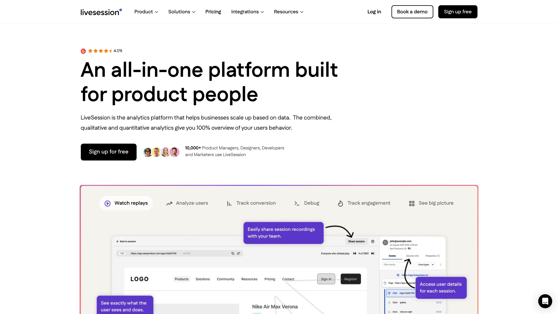
Livesession slots into the dashboard workflow at the diagnosis step. When a retention metric drops or an activation funnel shows an unexpected fall-off, you can link directly from the metric anomaly to a filtered session replay view for the affected cohort. Instead of opening a separate tool and rebuilding the filter from scratch, the context is one click away.
Livesession’s core capabilities for product teams include session replay with frame-accurate playback, heatmaps showing where users click and scroll, conversion funnels that surface drop-off by step, error tracking that links JavaScript errors to the sessions where they occurred, and integrations with Intercom, Zendesk, Shopify, and Segment. GDPR and CCPA compliance is built in, with field-level masking configurable at the collection layer.
For teams using analytics to drive growth, adding session-level context to a quantitative dashboard shortens the time from signal to hypothesis to experiment. Try Livesession alongside your existing analytics stack at Livesession.
Sources
Related articles



Get Started for Free
Join thousands of product people, building products with a sleek combination of qualitative and quantitative data.