
what is User Interaction Design? 7 Interaction Checks for Product Teams.

User interaction design is the practice of shaping how a product behaves and responds when someone clicks, taps, speaks, or moves through it, so every action gets a clear, predictable reaction. It sits inside the broader field of user experience, focused specifically on behavior and system states rather than the full journey. The ISO 9241 series and Jakob Nielsen’s usability heuristics anchor most of the discipline’s working principles.
The Five Dimensions That Define Interaction Design
Interaction designers often describe their work through five dimensions, a model that helps separate what feels like one messy problem into parts you can actually design against.
Words carry meaning through labels, button text, and microcopy. A button that says “Delete forever” communicates risk differently than one that just says “Delete.” Visual representations include typography, icons, and layout, the elements that make an interface legible before anyone reads a word. Physical objects and space cover the hardware a person touches or the room a voice assistant listens in, relevant for anything beyond a flat screen. Time governs animations, transitions, and how long something takes to respond, which shapes whether an interaction feels instant or sluggish. Behavior ties the other four together: what happens, in what order, and how the system reacts to input.
This model applies across a wide range of contexts:
-
Web and desktop software, where mouse and keyboard precision allow dense controls.
-
Mobile apps, where touch targets and gestures replace pointer-based interaction.
-
Voice interfaces, where there is no screen and feedback has to be audible.
-
Wearables, where screen space is minimal and interactions need to be fast.
-
Hybrid hardware and software systems, like a thermostat with a companion app.
ISO 9241-115:2024 separates conceptual design, interaction design, UI design, and navigation design into distinct activities, which is a useful way to understand where interaction design’s responsibilities start and stop relative to visual or navigational concerns. The standard frames these principles as applicable across methodologies, not tied to one design process or tool.
Core Principles and Heuristics Behind Good Interactions
A handful of principles recur across nearly every usability framework, and they give teams a shared vocabulary for critiquing an interface.
Visibility of system status means the product always shows what is happening. A spinner during a slow upload, or a progress bar during checkout, keeps people oriented instead of wondering if their click registered. Feedback confirms that an action had an effect, whether that’s a button changing color on press or a confirmation toast after a form submits. Affordance is about making controls look like what they do: a raised button looks pressable, a toggle looks switchable, supporting web accessibility for inclusive affordances. Mapping connects controls to their effects in a way that matches expectation, like a volume slider that moves right to increase sound. Constraints limit what a person can do at a given moment, such as graying out a “Submit” button until required fields are filled. Consistency keeps similar actions behaving the same way throughout a product, so a learned pattern in one screen still works on the next. User control and error recovery give people an obvious way to undo a mistake, like a “Discard changes” option instead of forcing a save.
These map closely to Nielsen’s heuristics, which a comparative study outlines as ten criteria including visibility of system status, match with the real world, user control and freedom, consistency and standards, error prevention, recognition rather than recall, flexibility and efficiency, minimalist design, error recovery, and help documentation.
-
Visibility and feedback build trust by confirming the system is responding.
-
Mapping and constraints reduce the chance of a wrong action before it happens.
-
Consistency and user control make recovery from mistakes fast and low-stakes.
Nielsen’s 10 heuristics remain the most widely referenced checklist for interaction quality, and the same research notes they work best as an early inspection tool, not a replacement for watching real users struggle with a real interface.
The Interaction-Design Process Is Iterative by Design
Interaction design rarely moves in a straight line from idea to finished product. Teams cycle through stages repeatedly, often revisiting earlier decisions once a prototype reveals a flaw that was invisible on paper.
-
Understand users and the context they operate in, through interviews, observation, or existing data.
-
Define the problem and requirements clearly enough that the team agrees on what success looks like.
-
Explore multiple flows and concepts before committing to one direction.
-
Prototype the behavior and states, not just the visual layout.
-
Evaluate using heuristic review, user testing, and analytics together.
-
Refine based on what evaluation surfaces.
-
Integrate and deploy, then keep evaluating after launch.
This structure mirrors HCI design-process frameworks, which describe the stages as understanding the problem, exploring the design space, developing the chosen approach, and integrating and deploying with evaluation running throughout rather than as a final checkbox.
Each evaluation method answers a different question. Heuristic review catches obvious violations early and cheaply. User testing with real participants, as covered in our UX testing best practices guide, reveals confusion that no expert would predict. Analytics, gathered after release, show how an interaction performs at scale rather than in a small sample. Our UX design process overview walks through how these stages connect to concrete deliverables.
Pro Tip: Run a quick heuristic pass before every round of user testing. It catches the obvious problems so your test sessions surface the subtler ones.
Interaction Design vs. UX and UI: Where Each One Starts and Stops
User experience covers the full journey, including research, information architecture, emotional response, and business goals. User interface design focuses on the visual layer, the colors, type, icons, and layout that a person sees. Interaction design sits between them, concerned specifically with behavior over time and how the system responds to input.
-
UX deliverables often include journey maps, research findings, and service blueprints.
-
UI deliverables include style guides, component libraries, and visual mockups.
-
IxD deliverables include interaction flows, state diagrams, and interactive prototypes.
A checkout flow shows how the three collaborate. UX research might find that users abandon carts because shipping costs appear too late. UI design decides how the shipping line item looks on the page. Interaction design decides what happens the moment a shipping option is selected, whether the total updates instantly or requires a separate confirmation step. That instant update, often called a microinteraction, is small enough to overlook but large enough to make or break trust in a stateful system like a multistep form or a live dashboard. Our GUI design overview goes deeper into how visual and interactive elements divide responsibility inside a single interface.
Methods and Tools for Designing and Validating Interactions
Interaction designers move through fidelity levels deliberately, testing different things at each stage. Low-fidelity prototypes, often paper sketches or wireframes, test flow and logic before anyone worries about visuals. High-fidelity prototypes, built in dedicated software, test timing, animation, and the feel of real interactions. Our guide to prototyping tools breaks down which fidelity level suits which stage, and our UX prototyping resource covers the workflow in more detail.
Heuristic evaluation works by having evaluators inspect an interface against a recognized set of principles, usually Nielsen’s ten, to flag likely problems before any user ever sees the design. It is fast and inexpensive, but research comparing the two methods found it catches different problems than real user testing does, which means one rarely substitutes for the other.
Analytics-driven approaches, including UI logs and behavior mining, extend evaluation into production, showing how interactions perform across real sessions rather than a handful of lab participants.
-
Prototyping tools for building and testing interactive flows before development.
-
Session analytics platforms for observing real behavior after launch.
-
A/B testing platforms for comparing interaction variants at scale.
Measuring Interaction Quality With Real Behavior Data
Heuristics and lab tests catch a lot, but some problems only show up once real people use a product at scale. User behavior mining, the analysis of UI logs capturing clicks, scrolls, and navigation paths, gives teams a four-part lens: the data collected, the technology used to capture it, the objective behind the analysis, and the theory that explains why a pattern matters.
Session replay, heatmaps, and funnel analysis apply that lens directly. A funnel might show forty people dropping off at the same onboarding step; replaying a handful of those sessions often reveals a button that looked disabled when it was actually clickable, a state-mismatch problem heuristics alone might miss.
A mismatch between what the system shows and what it actually allows is one of the most common sources of silent drop-off in onboarding flows.
Collecting interaction logs means handling personal data responsibly under frameworks like GDPR and CCPA, which ISO’s human-centered design guidance treats as part of the design lifecycle rather than an afterthought.
Pro Tip: When a funnel shows a drop-off, replay a sample of sessions before redesigning anything. The fix is often smaller than the funnel suggests.

A Quick Checklist for Evaluating Any Interaction
Before shipping a new flow, run it against a short list of checks.
-
Does the system show its status at every step?
-
Is feedback immediate after every action?
-
Are interactive elements visually distinguishable from static ones?
-
Does similar input always map to similar output?
-
Can a mistake be undone easily?
-
Are key flows instrumented so you can see real usage?
-
Has at least one real user tried it?
A useful starting set of metrics includes task success rate, error rate, the specific step where drop-off happens, and time-on-task. Applied to a mobile onboarding flow, that might mean tracking how many people complete signup, where they stall, and how long the final step takes compared to the rest.
Why Interaction Design Matters More in 2026
AI-driven interfaces and multi-device journeys make interaction design harder to get right by instinct alone. Reused patterns still matter, but context now shifts faster than any pattern library can keep up with. My advice is to trust established principles as a starting point, then validate every important flow against how people actually use it.
Pairing Session Analytics With Your Interaction Design Work
Heuristics and lab testing tell you what should happen. Session replay, heatmaps, and conversion funnels show you what actually happens once real people are clicking through your product, and the gap between those two is often where the most expensive usability problems hide.
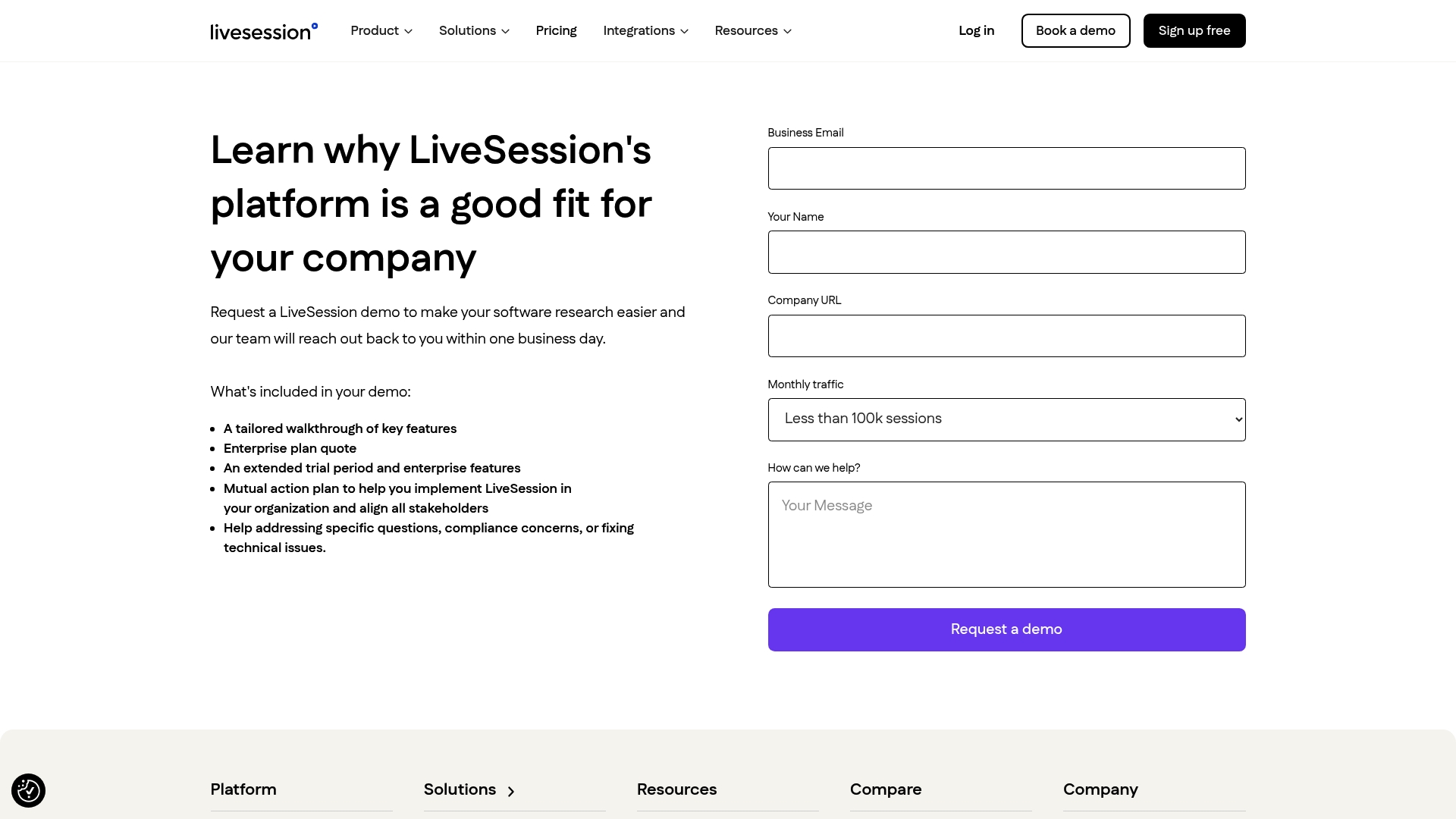
We built a session analytics tool to sit alongside the design work covered in this guide rather than replace it: instrumentation for your key flows, replay for the sessions that look confusing in the data, and funnels that show exactly where people stall.
-
Watch real sessions to catch state mismatches heuristic review tends to miss.
-
Use funnels to find the exact step where an onboarding flow loses people.
-
Pair heatmaps with your prototypes to confirm affordances actually get noticed.
Our plans start with a free tier and scale up through Basic, Pro, and Enterprise, so you can see this in your own product before committing to anything.
FAQ
What is UX with an example?
UX design covers the entire experience a person has with a product, from discovery through ongoing use. A banking app’s UX includes everything from how easy it is to find the transfer feature to how the app handles a failed transaction.
What is the user interaction design process?
The process moves through understanding users, defining the problem, exploring flows, prototyping behavior, evaluating with heuristic review and user testing, then refining and deploying. Teams typically revisit earlier stages as prototypes reveal new problems rather than treating it as a one-way path.
What are the 5 principles of interaction design?
Common frameworks emphasize visibility of system status, feedback, consistency, affordance, and user control with error recovery. Definitions vary across sources; some expand this list into Nielsen’s ten heuristics for more detailed guidance.
What is interaction design vs. UX?
UX covers the full end-to-end experience including research and strategy, while interaction design focuses specifically on behavior and system states, how a product responds to clicks, taps, or voice commands. Interaction design is one component inside the broader UX discipline.
How can I improve user interaction on my product?
Start by instrumenting your key flows so you can see where people drop off, then run a heuristic pass against known usability principles. Follow up with real user testing on the flows that show the most friction in your data.
Sources
Related articles


Get Started for Free
Join thousands of product people, building products with a sleek combination of qualitative and quantitative data.