
What Makes a Good Landing Page?

A landing page is usually defined as a standalone web page created for a specific marketing or conversion goal. According to sources like Wikipedia, it’s the place users “land” after clicking an ad, email link, or campaign snippet. Marketers treat it as a controlled environment – free from distractions – designed to move people toward one clear action.
And that's not wrong.
But in practice, a landing page behaves more like your digital business card. It often makes or breaks the first impression. If the message feels confusing or misaligned with user expectations, visitors leave. If it communicates value instantly and guides people smoothly toward the next step, it becomes one of the strongest conversion levers in your entire marketing strategy.
In the rest of the article, you’ll walk readers through the core principles of effective landing pages, the mistakes that weaken them, and the practical tactics teams use to improve performance.
What you’ll learn
- How to shape your landing page around one clear promise so visitors understand the value within seconds.
- How to guide users through the page using design, copy, and structure instead of relying on guesswork or “pretty visuals.”
- How to spot hidden conversion blockers using analytics and real user behavior recordings.
- How to run meaningful A/B tests that improve specific elements rather than testing randomly.
- How to evaluate real landing pages (the good, the bad, the ugly) and apply those lessons to your own campaigns.
Core principles of an effective landing page (the PAGE framework)
P → Promise: a clear value proposition
A successful landing page starts with a promise that matches the intent of your target audience. Your compelling headline, supporting headline, and first line of landing page content explain what the visitor gets and why it matters. Strong value propositions shorten decision-making, attract more qualified traffic, and help users understand your product or service within seconds.
It’s one of the simplest landing page best practices: give a clear message before the user scrolls. When people land on a single page from a search engine or a social media post, clarity keeps their attention and reduces bounce. A strong landing page always states the offer, the unique selling proposition, and the desired action upfront.
For example, if you sell a project management tool, the promise could sound like:
“Plan your week faster with automated scheduling — built for small teams.”
The headline tells visitors what you help them achieve.
The subhead clarifies who it’s for.
And the first paragraph gives users a quick sense of why choosing your solution may save time, solve a common friction, or improve their workflow.
A → Action: one goal, one path
High converting landing pages avoid anything that can distract users from the main call to action (CTA). Navigation menus, unrelated links, pop-ups, or long text blocks slow visitors down, dilute the journey, and hurt conversion rate.
Focusing the landing page structure on one action – sign-up, download, lead generation, demo request – creates a simple landing experience that moves potential customers forward. A strong call to action, placed early and repeated with intention, guides potential users toward the next step.
Sometimes, two CTAs are allowed when they follow the same intent but serve visitors at different readiness levels. For example:
- “Start free trial” + “View demo” for users who want to explore before committing.
- “Buy now” + “Add to wishlist” for ecommerce products with higher consideration.
- “Book a call” + “Download the guide” for service businesses nurturing colder traffic.
The key is that both CTAs support the same conversion path, not two unrelated goals.
G → Guidance: design, copy, and visuals that lead the way
A great landing page gives visitors visual and verbal cues that help them move through the content without friction. White space, a clean layout, and engaging visuals keep the user’s attention on the message instead of the clutter.
Benefit-focused copy helps users understand how your product or service solves their problem, while relevant images, user stories, and simple paragraphs support the narrative.
The best landing page designs guide how users interact with each section:
headline → benefits → proof → CTA,
for example:
- Headline: “Learn UX design skills you can use this month.” The headline sets a timeframe and expectation.
- Benefits: Clear points about beginner-friendly lessons, project-based learning, and feedback from instructors. Benefits show what the learner will gain, not abstract concepts.
- Proof: Student success snippets plus one or two portfolio examples. The proof demonstrates real-world outcomes.
- CTA: “Get started with software like Helpjuice.” The CTA fits the natural next step for motivated visitors.
Even a simple landing page can feel polished when the landing page design and copy work together to encourage visitors toward the desired action.
E → Evidence: social proof that builds trust
Social proof strengthens every claim you make. Testimonials, ratings, case studies, and logos from satisfied customers help potential customers feel confident that your offer delivers results. This is one of the key components of a high converting landing page: when visitors see that others succeeded, they believe they can too.
Evidence also helps with landing page optimization. It supports your value proposition, reduces hesitation, and answers doubts before they appear. Trust elements are some of the most powerful tools for generating leads, especially when you’re speaking to a specific audience that relies on credibility before sharing visitor information or completing a form.
User behavior & optimization strategies
Extremely underrated.
High converting landing pages aren’t built once. They evolve based on how real people behave. The more you understand what visitors do, where they hesitate, and what motivates them to act, the faster you improve your conversion rate.
These are the three data pillars every team should rely on.
#1 Analytic metrics every team should track
Start with the quantitative signals. They tell you what is happening.
Key metrics worth monitoring include:
- Bounce rate: Shows how many visitors leave without engaging. A rise often signals a weak value proposition or slow loading time.
- Conversion rate: The percentage of users who complete your desired action. Even small lifts here (0.5–1%) compound into major gains over time.
- Click-through patterns: Which buttons, sections, or visual elements attract attention. Useful for spotting ignored CTAs or confusing layout choices.
- Traffic sources: Helps you check if the right target audience is landing on your page. Mismatched traffic often leads to low engagement.
- Device breakdown: Reveals if mobile devices struggle with layout, forms, or page speed.
These analytics help you diagnose issues in bulk, but they don’t tell you why people behave a certain way. For that, you need qualitative insight.
There are cases when some of these metrics will contradict each other, and that’s normal. A landing page can show a high bounce rate but still deliver excellent conversion rates because the people who do stay convert at a strong percentage. Or you might see strong click-through patterns paired with low conversions, which often means the page attracts interest but fails to close the deal.
Conflicting signals often point to deeper issues such as:
- Misaligned traffic → Paid campaigns drive clicks, but the landing page doesn’t match the user intent.
- Fragmented device performance → Mobile users bounce due to layout friction, while desktop users convert normally.
- Overly curious visitors → People explore (high clicks) but don’t see enough value to take action (low conversions).
- CTA placement or timing problems → Users engage with content yet miss the action point entirely.
Instead of treating contradictory metrics as errors, treat them as clues. The numbers show the patterns, but not the motivations behind them; which is why the next step, qualitative behavior analysis, becomes essential for understanding the full picture.
#2 Qualitative insights from session and behavior tools
Behavior tools fill the gaps that numbers can’t.
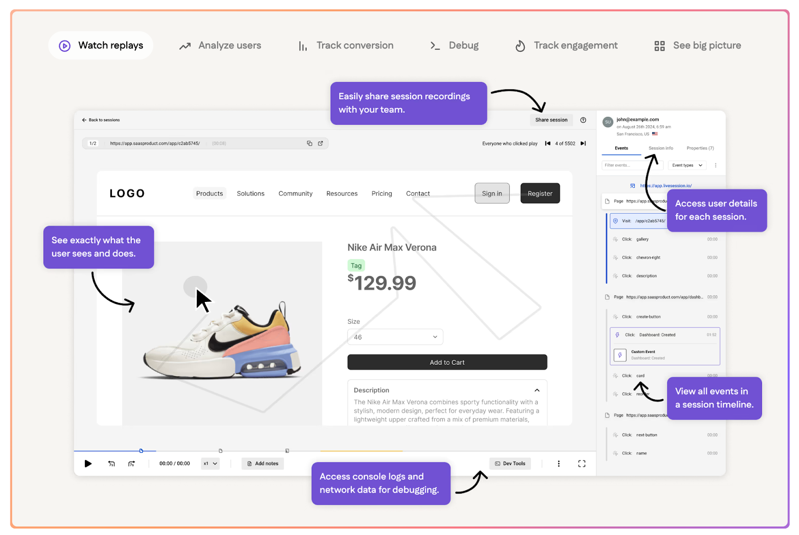
Session replay platforms like LiveSession show how users interact with your landing page in real time:
- where they scroll,
- where they pause,
- what they try to click,
- where they get stuck,
- and the exact moment they decide to exit.
This enables you to spot UX issues such as rage clicks, dead zones, confusing form fields, CTAs placed too low, or messaging that fails to hold attention.
Qualitative data becomes especially useful when analytics alone can’t explain what’s going on. These insights reveal the experience behind the numbers and help you understand the decisions users make on the page.
For example, when you encounter:
- High traffic, low conversions. Session replays show whether visitors scroll past your value proposition, skim the page too quickly, or hesitate at key sections. You might discover that the headline doesn’t match ad intent, or that the CTA appears too late in the journey.
- Strong ad performance, weak on-page engagement. If campaigns bring the right target audience but users bounce instantly, behavior recordings help confirm whether the landing page design feels overwhelming, loads too slowly, or fails to deliver on the promise made in the ad.
- Users abandoning forms midway. Replays identify the exact fields that cause friction: long phone numbers, unclear labels, unnecessary questions, or validation errors that frustrate users. This gives you immediate direction for form simplification.
- Mobile visitors dropping off faster than desktop. Watching mobile sessions shows whether buttons are too small, text feels cramped, images shift during load, or key elements fall below the fold. These insights support mobile-first landing page optimization.
Qualitative tools make it easier to understand not only where users struggle, but why → turning raw behavior into concrete ideas for improvement.
Pairing this with analytics creates a full picture of what shapes user decisions.
#3 A/B testing and iteration
Old good.
Once you understand what isn’t working, run structured experiments. A/B testing helps you validate improvements before rolling them out widely.
Common elements worth testing include:
- Headlines: Does a benefit-first headline increase interest?
- CTA text and placement: Should “Get started” live above the fold or after the first benefit block?
- Layout variations: Short vs long pages, different visual hierarchies, new placement of trust badges.
- Form length: Cutting form fields often boosts sign-ups.
- Images or hero visuals: Real product shots vs mockups, people vs objects.
Even small tests (such as shifting the CTA one section higher) can create noticeable wins when paired with a strong value proposition.
What matters most is iteration:
- Observe behavior
- Form a hypothesis
- Test a variation
- Measure results
- Repeat with the next bottleneck
Landing page optimization is a loop, not a one-time task.
Checklist: what you can apply today
✔ Create landing pages with a single purpose
Keep the message focused. Your engaging headline should capture visitor’s attention in just a few words and lead directly to a clear call.
✔ Aim for quick loading pages on all devices
A mobile friendly layout prevents early drop-off and keeps users from clicking back to the website homepage or other pages out of frustration.
✔ Use relevant keywords that match user intent
Help visitors understand the offer instantly and help search engines classify the page correctly. Keywords should support clarity, not clutter it.
✔ Add only the elements that support the decision
Visuals, benefit blocks, and short explanations should move visitors toward the action. Remove other elements that cause friction or interrupt the flow.
✔ Write attention grabbing copy that feels human
Use an engaging headline, a simple supporting line, and tight benefit bullets. This keeps visitor’s attention and reduces cognitive load.
✔ Check how real users behave on the page
Use session replay or behavior tools to see where people pause, scroll, hesitate, or leave. These insights guide better optimization than guesses.
✔ Track basic metrics consistently
Monitor conversion rate, bounce rate, device splits, and click paths to understand how users interact with the content and where improvement is needed.
✔ Improve landing page performance with A/B tests
Experiment with headlines, visuals, form length, and CTA placement. Even small wins add up and help business owners get more leads without more spend.
✔ Align your landing page with email marketing
If email campaigns send traffic to the page, make sure the message, offer, and tone match. Misalignment lowers trust and decreases conversions.
✔ Consider tools for every stage of optimization
- Design: builders that help create landing pages quickly
- Analytics: platforms that track core metrics
- Behavior: session replay tools that show the real experience
- Testing: A/B tools that validate ideas before scaling
Following this checklist helps turn any page – from a simple landing page to a popular landing templat – into a more predictable and efficient conversion asset.
Landing page hall of fame: the good, the bad, the ugly
Stitch Fix
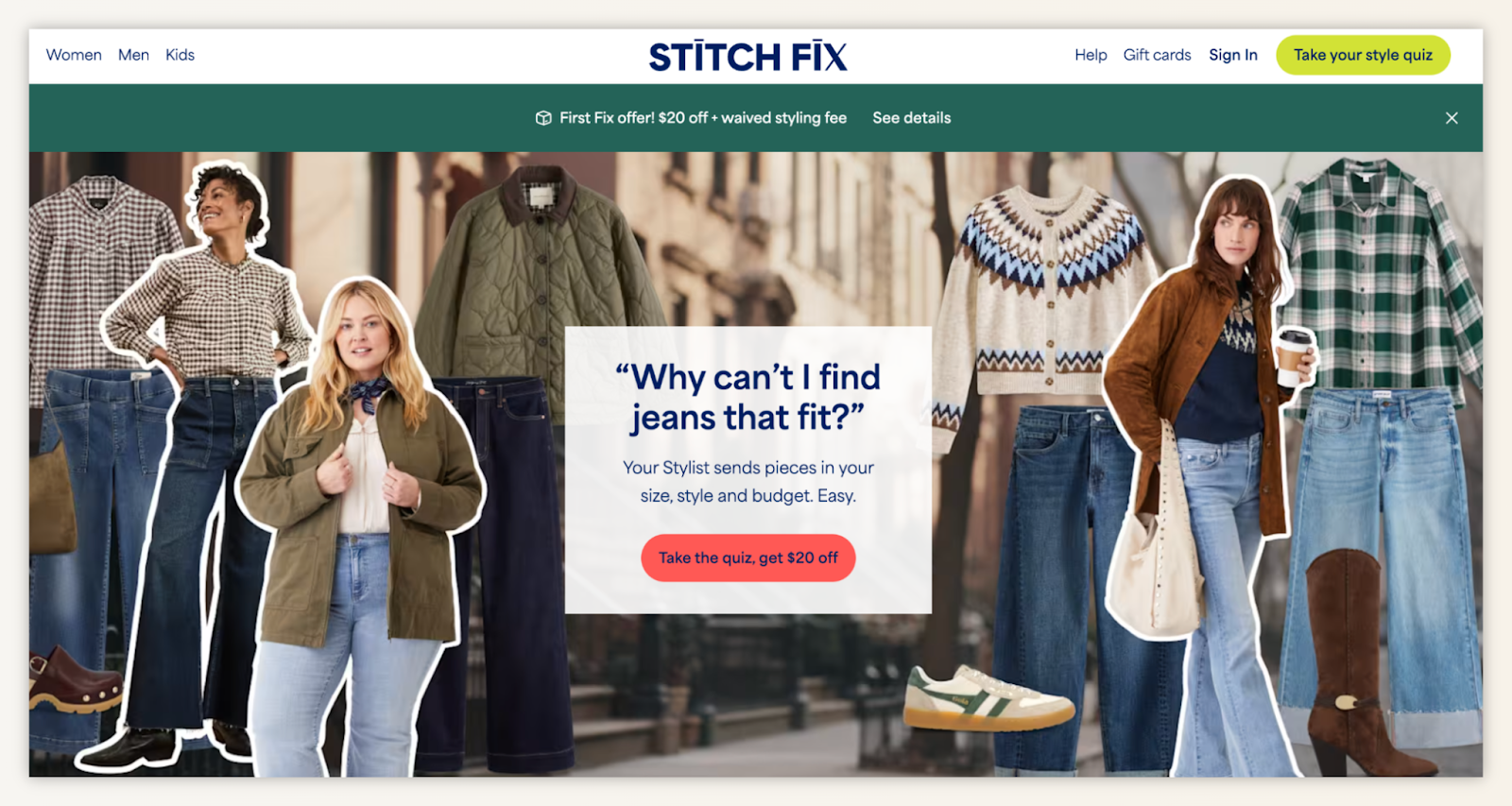
What’s good
- Flawless problem-led hook: “Why can’t I find jeans that fit?” speaks to a real frustration → and specific pain converts.
- Clear CTA with incentive: “Take the quiz, get $20 off” pairs action with immediate reward.
- Strong product-context visuals: Real people, diverse models, and real clothing = trust-building.
What’s bad
- Visual clutter on first view: The collage-style background distracts from the main message.
- The header promo bar competes with the core CTA: Two offers at once = cognitive load.
What’s ugly
- Juxtaposition of models + floating apparel: The cutout-layered collage looks slightly chaotic and cheapens an otherwise strong brand feel.
Maxio
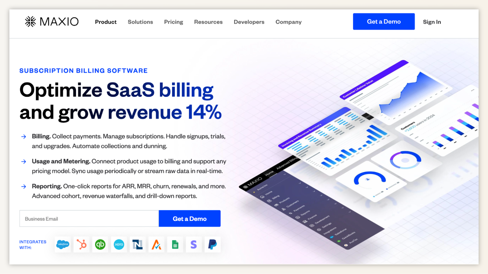
Subscription billing software landing page example
What’s good
- Sharp, outcome-first headline: “Optimize SaaS billing and grow revenue 14%” is concrete, quantified, and instantly relevant to a SaaS audience.
- Tight three-pillar benefit section: Billing → Usage → Reporting gives a quick mental map of the product.
- Strong visual hierarchy: Clean spacing, bold typography, and product UI mockups keep the page scannable.
- Single, unmistakable CTA: “Get a Demo” is prominent and consistent.
What’s bad
- No quick credibility indicators above the fold: A number like “trusted by 2,000+ SaaS companies” would strengthen the pitch immediately.
- Email field next to the CTA slows intent: Asking for the business email right away adds friction before the user commits mentally.
What’s ugly
- Abstract hero visuals: The graphs look nice but don’t communicate what makes MAXIO different. A clearer product value preview would land stronger.
Gamma App
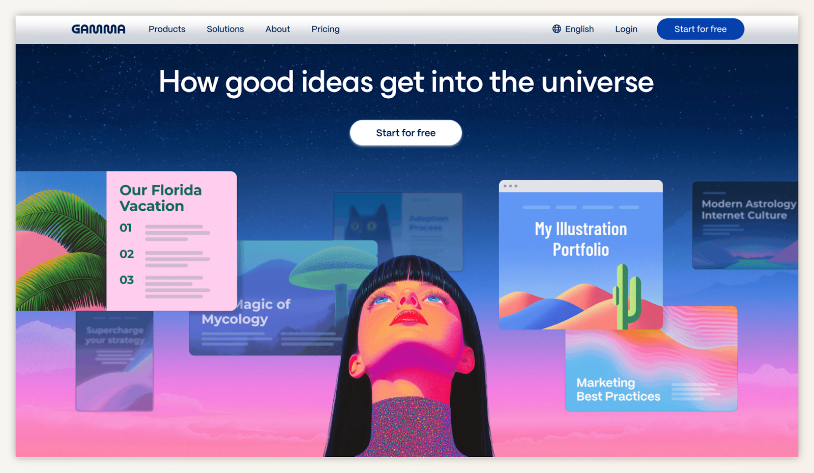
What’s good
- Attention-grabbing visual identity: The bold illustration and cosmic theme immediately signal creativity.
- Clean, strong CTA: “Start for free” is clear, simple, and matches SaaS expectations.
- Clear emotional message: “How good ideas get into the universe” speaks to creators, not features.
What’s bad
- Abstract headline: Inspiring, yes — but not explicit. It doesn’t tell new users what Gamma does (AI presentations? docs? portfolios?).
- Busy hero composition: Multiple floating cards dilute focus and make it harder to process the CTA quickly.
What’s ugly
- Identity over clarity: The visual flair may win awards, but it forces users to guess the product category before understanding the value. That’s friction.
UTA: Master of Science in Nursing – FNP Online
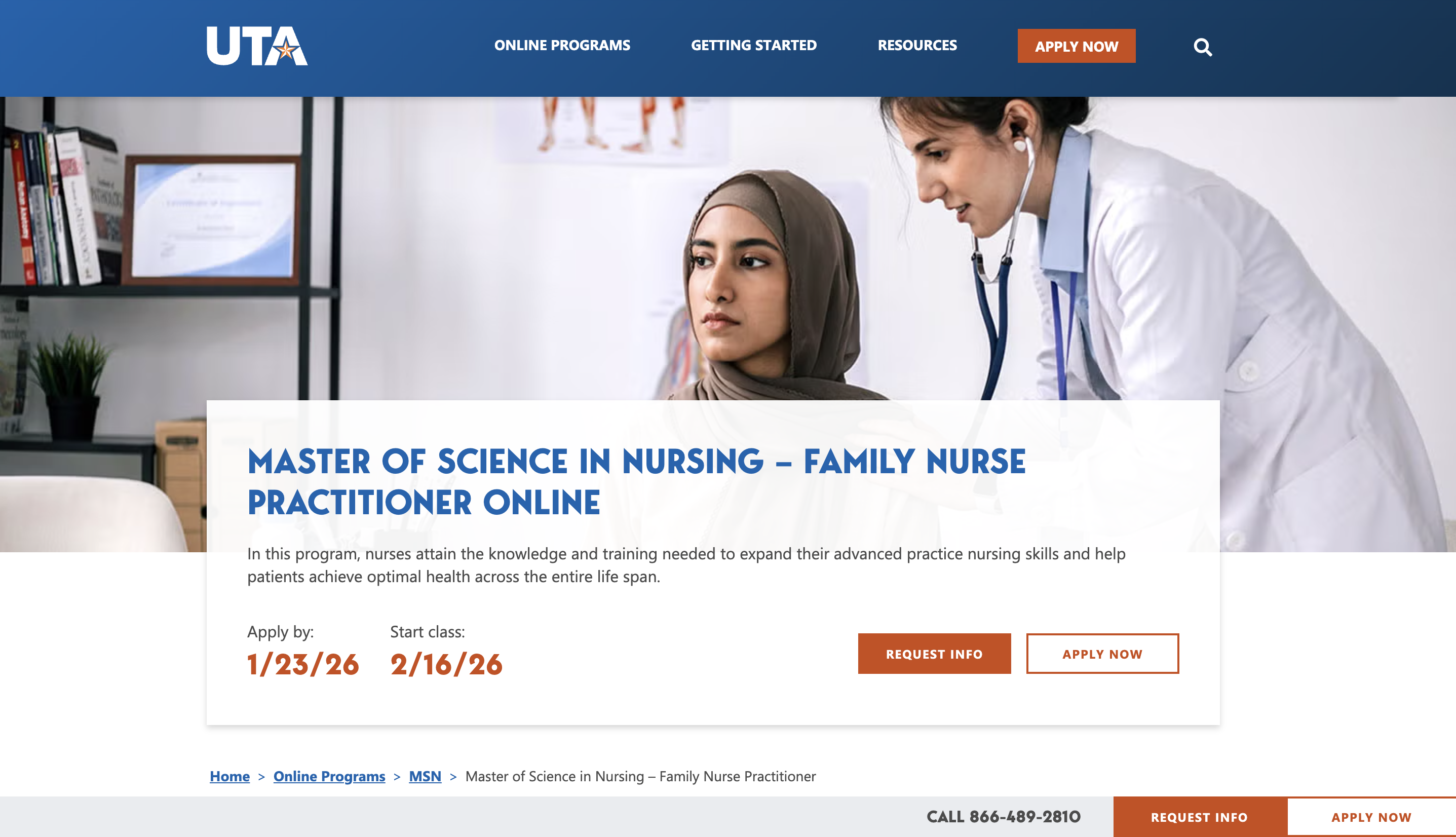
What’s good
- Urgency-driven data: Placing the "Apply by" and "Start class" dates front and center is a masterclass in providing "Promise" and "Action." It answers the visitor’s most immediate logistical questions and creates a natural deadline for decision-making.
- Professional, inclusive imagery: The hero image feels authentic and representative of the diverse nursing workforce. It establishes "Guidance" by helping the target audience see themselves in the program.
- Clear value headline: There is zero ambiguity. The visitor knows exactly what the product is within one second of landing.
What’s bad
- The "leaky" header: A true landing page should be a "controlled environment." This page has a full navigation menu (Online Programs, Getting Started, Resources) and a search icon, giving users too many ways to exit the conversion funnel before they've even read the first paragraph.
- Competing CTAs: There are three "Apply Now" buttons visible in the initial view (Header, Hero, and Footer). When everything is a priority, nothing is.
What’s ugly
- The "white block" layout: The large white content box is placed directly over the center of the hero image. It feels less like a modern "Guidance" design and more like a template limitation. It cuts off the subjects of the photo awkwardly, creating visual friction rather than a smooth flow from the image to the text.
- CTA hierarchy confusion: In the hero section, "Request Info" is a solid orange button while "Apply Now" is a ghost (outlined) button. This tells the user that "Requesting Info" is the more important action. However, the top-right header and the breadcrumbs prioritize "Apply Now." This conflicting visual hierarchy can cause "guesswork" for the visitor.
Instantly
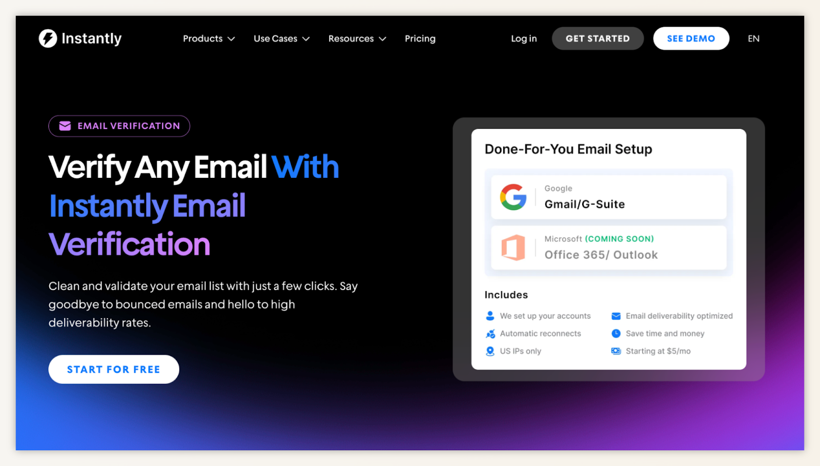
What’s good
- Ultra-clear promise: “Verify Any Email With Instantly Email Verification” leaves zero ambiguity.
- Visual proof snapshot: Showing Gmail/G-Suite and Outlook integrations builds confidence fast.
- Simple supporting copy: “Say goodbye to bounced emails…” communicates the problem → solution path in one line.
- CTA matches intent: “Start for Free” reduces risk and motivates immediate action.
What’s bad
- Heavy black background for a trust-based product: Email verification is a “safety” category; dark branding can feel aggressive.
- Hero section is text-dominant: The right-side visual is helpful but doesn’t show the actual verification experience.
What’s ugly
- No quick credibility signals above the fold: Email deliverability tools rely heavily on trust. Missing: accuracy stats, deliverability improvements, or recognizable customer logos.
Prose
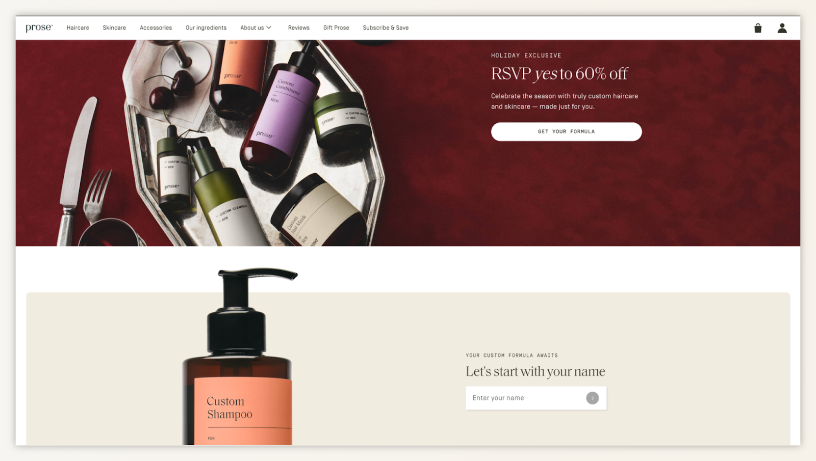
What’s good
- Visual storytelling: The hero image feels like a premium editorial spread. It communicates luxury without saying it.
- Simple CTA: “Get Your Formula” ties directly to the customization promise.
- Personal entry point: Asking for a name creates instant emotional engagement and nudges the visitor into the quiz funnel.
What’s bad
- Value proposition is soft: “RSVP yes to 60% off” is generic. Nothing here explains why Prose is unique compared to any other haircare brand.
- Split focus: A sale announcement competes with a personalization flow → two different mindsets.
What’s ugly
- Hero image overwhelms the message: Beautiful? Yes. But functionally, it’s cluttered and visually heavy, delaying clarity about what the product actually is.
Backlinko
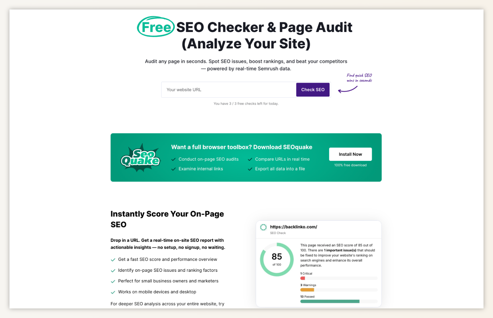
What’s good
- Frictionless value: A single input field (“Your website URL”) makes the action feel effortless.
- Immediate payoff: Users see a sample score, making the value feel real before engaging.
- Clear CTA hierarchy: “Check SEO” is obviously the first step, with supporting CTAs (“Install Now”) placed logically below.
- Strong trust anchor: “Powered by real-time Semrush data” is a credibility booster.
What’s bad
- Design feels utility-first (not user-first): It works, but it reads more like a tool panel than a landing page.
- Messaging lacks emotional pull: There’s clarity, but not much urgency or differentiation.
What’s ugly
- Visual clutter post-fold: Multiple green checkmarks, toolboxes, and score modules pile up quickly → overwhelming for non-SEO users.
- Branding inconsistency: The SEOQuake insert feels slightly disconnected from the Semrush brand experience.
JBL
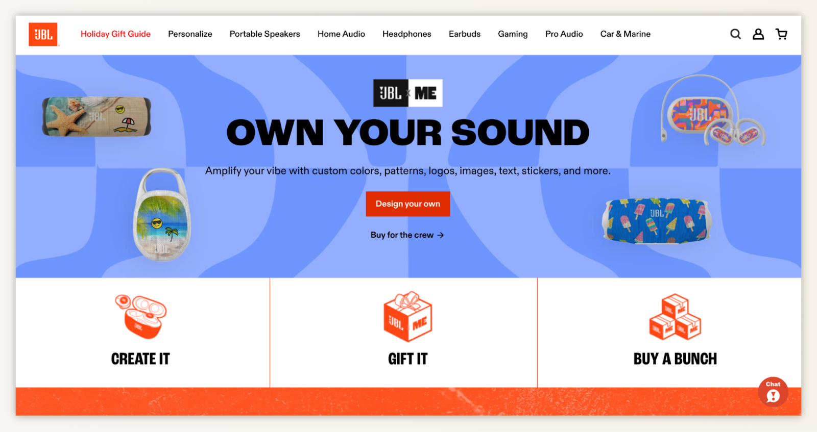
What’s good
- Powerful, identity-driven headline: “OWN YOUR SOUND” is bold, memorable, and immediately signals personalization.
- Instant clarity on the offer: The subhead explains exactly what “custom” means — colors, patterns, logos, text, stickers. Zero ambiguity.
- CTA with strong intent: “Design your own” is both aspirational and actionable. It matches exactly what the audience wants to do here.
- Visual proof in the hero: Showing multiple customized speakers removes guesswork and helps visitors imagine their own designs.
- Segmented next steps: “Create it / Gift it / Buy a bunch” smartly supports different buyer motivations (self, gifting, bulk purchase).
What’s bad
- Overwhelming visuals: The hero is extremely busy — colors, patterns, gradients, and floating products compete for attention rather than guiding it.
- Weak value framing: It shows what the user can do, but not why this matters (e.g., uniqueness, durability, quality, gifting impact).
- Two CTAs stacked oddly: “Design your own” and “Buy for the crew” fight each other a bit, especially since the second CTA is visually small yet action-heavy.
What’s ugly
- Navigation-heavy header: For a landing page meant to focus on customization, the full ecommerce nav pulls attention away and adds escape routes.
- Lack of trust or quality indicators: No reassurance about print quality, durability, delivery times, or satisfaction — unusual for a customization product.
- Branding noise in the layout: The lower section uses chunky orange branding and icons that visually clash with the hero’s smooth, modern aesthetic.
No matter what, though
In the end, every landing page rule, framework, and best practice leads back to the same idea people on Reddit summed up perfectly:
Everything else (design trends, headline formulas, clever visuals) only matters if it helps the right visitors take the next step. When you understand why your audience chooses you and you shape the page around that outcome, you’re already ahead of most teams.
Over to you
A landing page only works when it earns attention fast. The strongest ones do this with a sharp promise, a clear call, and a structure that guides visitors without getting in their way. When you pair clean design with real user behavior data and continuous testing, you turn a single page into a reliable growth engine.
Keep the message simple, watch how people actually use the page, and improve one element at a time: that’s how good landing pages become high-converting ones.
Related articles


Get Started for Free
Join thousands of product people, building products with a sleek combination of qualitative and quantitative data.