
How to create a heat map - best practices & mistakes to avoid


Do you know how to create a heat map? If you run a website, there are many reasons why you should. If used properly, they can help improve your UX, which will make navigating your site easier for users.
In this blog post, we will take a closer look at how to make a heat map, what the best practices for heat map creators are, and some common mistakes that you should avoid to ensure clarity and relevance.
Best practices for generating heat maps that are worth following
By generating heat maps for your website, you have the opportunity to gather better insights into how users navigate it. Furthermore, you can structure your site in a way that will improve sales, boost conversion rates, and keep visitors coming back.
Here are some of the best practices that we recommend to help you grow your business’s digital footprint and boost sales.
1. Establish which pages you need to set up your heat map on
Although it might be tempting to simply create them for every page, we recommend heat map creators to focus first on the most-viewed pages that are crucial for their organization. These include your homepage , which is often the first page that users visit, and others that are of high importance for your business, such as pricing. If you have an eCommerce store or campaign pages for promotions or giveaways, it’s also worth setting up a heatmap layer on them. That’s because they, in particular, need to be user-friendly and easy to navigate.
Other places worth considering for heat mapping are newly launched pages. They require special attention, since, for example, any design non-clickable elements that need refining should be identified either before or shortly after publishing. If the page features calls-to-action (CTAs), they also need to be tested to determine whether or not they are placed correctly and can generate interactions.
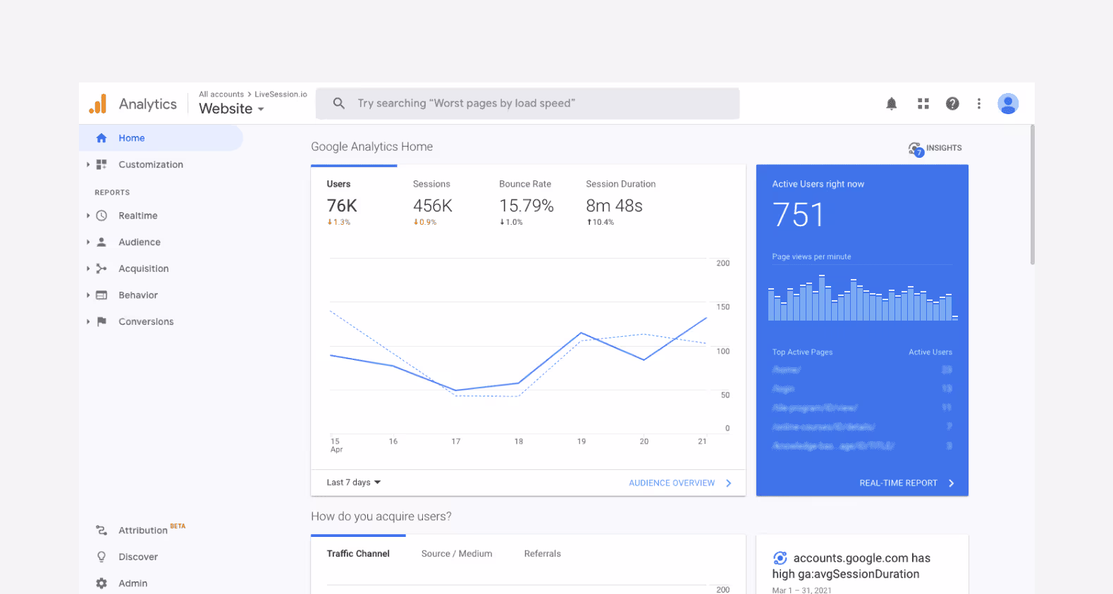
Various types of heatmaps can also be used to target pages with high bounce rates and those that have low click-through rates (CTR). Pages that do not yield their expected conversion rates need extra attention, and using your Google Analytics dashboard should enable a product manager to identify which of them are not performing well.
Last, but not least, remember to also review conversion elements and paths, i.e. user journeys that demonstrate how your users navigate your website from first entry up to placing an order or taking another desired action. You need to use your heat map data to optimize the conversion funnel and ensure that visitors’ paths are seamless and error-free. With the right heat map report, doing this is easier than ever before.
2. Decide what information you need to verify
Before you launch your heat map, it’s worth agreeing on the problems or issues that you’re aiming to tackle by doing so. If, for instance, one or more of your product pages have a big drop-off rate, making a heat map will enable you to identify where users end their journeys. You can then further investigate the issue by using other tools such as session recordings or surveys, which we will talk about later in this article.
3. Use various types of heat maps (or establish the ones you need most)
Once you have determined which areas of your website call for improvement, such as in the aforementioned example of product pages, you might uncover that you’d benefit from more than one type of heat map. For a comprehensive overview, you can refer to our dedicated piece reviewing all the heatmap options to choose from.
For instance, using a scroll map and a click map together will help you to determine how far down page users scroll and which areas generate clicks and interest. Ultimately, before deciding on the heat map type, aim to establish which comprehensive heatmap data you need most in order to resolve any usability problems and improve on-site conversion.
4. Use heat map data in conjunction with session recordings and eye-tracking software
Enhancing your website’s UX with heat map data to illuminate all on-site interactions can give you the edge that you need to cultivate exceptional experiences. However, bear in mind that while a heat map layer lets you see the bulk of user activity on each site, you might still need other tools to dive deep into each user’s on-site actions.
Here’s where session recording solutions come into play, giving you the option to watch a video of how each user moves and interacts with your website. To make the most of your heat map analysis, we recommend using a solution like LiveSession to use heatmaps and session recordings together
Also, if you’d like to learn which parts of your website are most and least viewed, consider using eye-tracking software to create hover maps. As this requires wearable equipment, however, it is most commonly used in a lab environment as part of usability testing sessions. We will discuss them in the next point.
5. Verify your findings with other tools before drawing any conclusions
Once you have made your heat maps, it is important not to treat the gathered data as final. Cross-check your findings with tools such as Google Analytics and, where possible, run website surveys to gather more information.
Additionally, you can take advantage of user testing labs where participants are asked to complete specific tasks. Depending on your preferences, you can either sit back and quietly observe them or ask testers to comment on each step they take. Consider conducting anonymized user sessions, as some respondents might not be comfortable providing feedback openly.
6. Make use of a heat map generator
Heat map generators are mapping software tools that take your website data, track the user behavior, and based on that create a visual representation of data. Most of them use the colormap range (from green to red) to essentially show the radius of influence - color concentration shows scroll depth data, where the highest traffic is, and which elements people most often click.
Heat map generators are the best choice for heat mapping. A common color scale makes analysis easier and helps you detect any errors much faster.
Now that you know how to create a heat map, let’s take a look at the mistakes that you need to avoid.
Mistakes to avoid when generating heat maps
1. Don’t draw conclusions too early
When making heat maps, it can be tempting to gather data as fast as possible so that you can move straight to implementing the solutions. However, it is important that you do not rush the process. Not only do you require a sufficient number of website visitors in order to gain credible user insights, but you also need to set realistic deadlines for data gathering right from the very start. This will ensure you get the answers you need without the risk of jumping to the wrong conclusions.
2. Not supporting your heat map findings with user feedback
As mentioned earlier, heat map data does not only give you a bird’s eye view of all user actions. More often than not, they are also anonymous, which means you don’t have the option to collect qualitative user feedback. Namely, you can’t reach out to specific users and ask them for more detailed explanations of their actions.
You can tackle this potential obstacle with user testing sessions so that you can ask the participants about your website content and therefore understand which areas you must further focus on. You can do so by either talking to testers directly or asking them to finalize the session by taking a survey to provide feedback.
Last, but not least, if you decide to organize user testing sessions, remember to account for any visual impairment or website responsiveness issues. These are the usability areas that a heat map analysis might not clearly point you towards.
3. Forgetting to block your IPs
When generating heatmap visualization, you need to ensure that the data you gather is from website users who are not your employees. Not blocking IPs will mean that you could be gathering data from within your own company, which is far from ideal.
This is especially true when testing newly launched pages that are often viewed by in-house testing marketing teams or other colleagues. As such, you should always double-check if internal user traffic is not included in your analysis to ensure that your data is credible.

Source: Unsplash
As such, you should always double-check if internal user traffic is not included in your analysis to ensure that your data is credible.
4. Lack of user context
No two web users are alike, so you need to consider your various customer personas with their own challenges, goals, pain points, and on-site visitor behavior. Some visitors will be interacting with your website for the first time, while others are going to be returning customers.
Consider splitting up your testing to reflect these different experiences. We recommend analyzing how new customers interact with the core content on your website, product, and services pages separately from those who already know it well and are more comfortable with the given information.
However, if both your new user and established customer groups are struggling to finalize certain processes, product or interface familiarity won’t be to blame. There is the likelihood of a wider issue with the UX that will need to be addressed promptly.
5. Treating the number of spotted actions as indicators of success
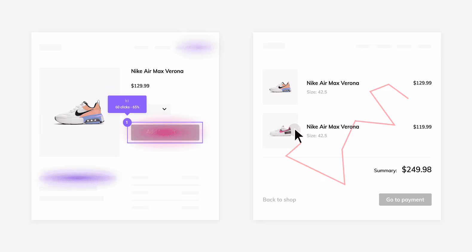
Not all repeat actions indicate success. Consider, for example, “rage clicks”. These are erroneous button presses that users make when clicking on content repeatedly as a result of being unable to move successfully further along the user journey.

Sometimes, users also navigate back to a webpage on more than one occasion or click on elements such as CTA buttons several times. This doesn’t necessarily mean interest in certain content though, especially if your conversion rate simply doesn’t correspond to the number of interactions.
If that’s something you notice in your data, you should make sure the buttons are working properly before making any design changes.
How to create a heat map – final thoughts
Generating heatmap help documentation can provide an exceptional source of data to enhance your digital presence. Always retain your focus on the data you require, augment your findings with additional tools and user testing, and be clear on what your picture of success looks like for user engagement. It could be the game-changer you need to boost your business and gain customers.
For heat maps and session recordings, look no further than LiveSession – we offer a free trial that you can check out today.
Frequently asked questions
What is a heat map generator?
A heat map generator is a tool that creates a visual representation of data using color-coding to represent cell values. It is used to analyze numeric and demographic data and identify trends.
What types of data are commonly used for heat mapping?
Sales data, demographic data, and numeric data are commonly used for heat mapping.
What is a dynamic heat map?
A dynamic heat map is a type of heat map that is created in real-time and updated automatically as new data is added.
How do heat maps help sales teams?
Heat maps help sales teams to identify trends and patterns in sales data, which can help them to make informed decisions and improve their performance.
What is the color scale in a heat map?
The color scale in a heat map is used to represent different values in the data set, with darker colors representing higher values and lighter colors representing lower values.
How do heat maps help to visualize complex data?
Heat maps help to visualize complex data by using color-coding to represent data points, making it easier to identify patterns and trends.
What tools can be used to create heat maps?
Heat maps can be created using various tools, including Microsoft Excel, Google Sheets, and custom heat map generators.
What is conditional formatting in heat mapping?
Conditional formatting is a feature in heat mapping that allows users to highlight certain values or data points in a data set based on specific criteria.
How do website heatmaps help with analyzing user behavior?
Website heatmaps provide a visual representation of user behavior on a web page, including where users click and how far they scroll, which can help website owners to identify areas for improvement and optimize their website for better user experience.
How can actionable insights be gained from heat maps?
Actionable insights can be gained from heat maps by analyzing the data and identifying patterns and trends, which can then be used to inform decision-making and optimize performance.