
How to analyze heatmaps – an actionable guide


If you own a website, chances are that you’ve considered setting up a heatmap. Perhaps you even have one set up already, but find it troubling to make sense of all the color schemes or marks and can’t properly interpret your findings. Although it might seem overwhelming at first, with the right instructions, conducting and drawing conclusions from your heatmap analysis will be pretty straightforward!
In the following article, we’ll explain how to read a heatmap and share a few best practices. We’ll also tell you about some other heatmap tools that you may find useful to gain a solid understanding of what your audience thinks about your site and needs from a service like yours.
Let’s jump right in.
Heatmap analytics – best practices explained
Below, we will share a few tips to help you make the most of your heatmap analytics.
Below, we will share a few tips to help you make the most of your heatmap analytics.
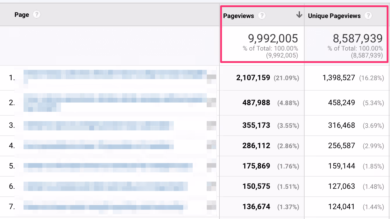
You might be wondering if there is such a thing as a ‘Google Analytics heatmap’? Not quite. However, Google Analytics is a great starting point in your heatmap endeavors because it can help you decide which web pages it would be worth setting up an AI-generated heatmap on. Among others, these can be pages that are poorly optimized for conversion or have bounce rates well above your industry standard. The general rule of thumb is to focus on pages with sufficient traffic to ensure that your analysis is statistically relevant.
How to read a heatmap
Assuming that you’ve already set up a heatmap, you may now be wondering how to read it. Here’s an explanation of the general rules and those that are relevant to specific and popular types of heatmaps, such as click and scroll maps.
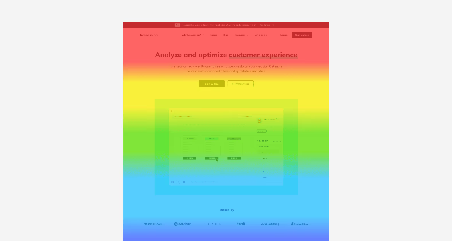
Understanding basic heatmap colors and what they indicate
In the most simple terms, heat map colors indicate areas on your webpage which are “hot” (i.e. get a lot of engagement such as clicks, looks, or scrolls) and those which are “cool” (get the fewest notices or interaction from site visitors). The “hotter” the area, the warmer the shades of color – think of yellows, oranges, and reds (with the latter colors pointing to the most noticed parts of your page). Conversely, areas with few interactions will be marked in green and blue colors (remember, it’s good to think of blue as being ice-cold).
Notice where people click (mouse-tracking heatmaps)
Using a click map can help you do the following:
- Identify the most clickable and non-clickable elements on your website, as well as those that don’t get any clicks. This will help you find the best spots for placing your CTAs.
- Determine how many clicks each CTA gets- does any button on the page get more clicks than the most important one? Or maybe there’s a banner or sidebar that distracts users on their way to purchasing? A good example of such a scenario is a banner for a free ebook that distracts users from buying a paid one.
- Spot rage clicks or error clicks- are there any web areas or a dynamic element that visitors click on intensely? This might indicate visitor frustration. For example, if they click on a CTA and nothing happens (dead click), they might keep pressing. This could tell you that your CTA lacks a link or that it’s broken. Here’s where a powerful tool like LiveSession will come to the rescue, allowing you to easily spot frustration for users in your heatmap statistical analysis.
Here’s where a usability tool like LiveSession will come to the rescue, allowing you to easily spot customer frustration in your heatmap analysis.
Learn how far down the page people scroll (scroll map)
Another benefit of using graphical analytics is assessing the relevance of your content. To learn if people lose interest you can turn to scroll maps, which will help you check how far down the page people browse.
It’s worth bearing in mind that just because someone stops scrolling at half the page, this doesn’t necessarily mean they aren’t interested in your content or your offer – it’s just one of the possible scenarios. It may also indicate that any questions they had were answered and they are ready to convert.
To find the reason why people stop scrolling, you should ask additional questions like “Did they click on any CTAs?” To get a detailed overview of how visitors behave on your website, you should turn to session recordings.
Identify which parts of your page users ignore (eye-tracking & click maps)
One way to create a good user experience for site visitors is paying attention to elements that are frequently ignored. You must find the reason behind any unexpected behavior – are there any areas that get zero clicks or parts of the page where people don’t look at all?
Eye-tracking is also handy for spotting where people focus. It can tell you where to place your CTAs according to what elements people spend the most time looking at. Eye-tracking can also indicate the same for written content – for example, something that is too difficult to understand and so people spend too much time looking at it.

Bear in mind that an eye-tracking heatmap is, however, a method that requires a special device. As such, it’s mostly used in a lab environment.
Avoiding heatmap bias – how and where to cross-reference your findings?
Now that you know how to read a basic heatmap, it’s worth addressing the issue of color map bias. As you can see from the above section, heatmapping will tell you a lot about what is happening on your site.
However, it will not always reveal why. For this reason, you should supplement your hot spot analysis findings with actionable insights from other tools. We particularly recommend:
Session recordings
Unlike hot spot maps which show you the bulk of interactions, session recordings allow you to watch recordings of specific users. Let’s assume a scenario when you notice on a heatmap that your “add to cart” button gets a high volume of clicks, but this doesn’t translate to the number of people who proceed to finalize a purchase. To find out the reason, you could decide to turn to session recordings. After watching, say, 10 videos of various user sessions you may notice that an error is to blame – people click on the “add to cart” element on their wishlist page but the button doesn’t work, so users simply decide to leave your site.
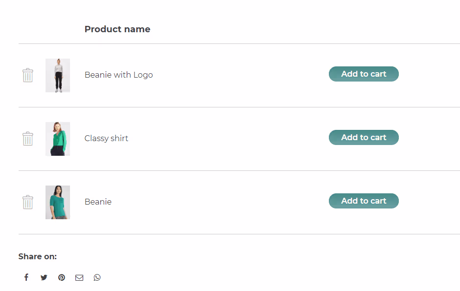
Source: WooCommerce
Customer surveys – qualitative & quantitative
As mentioned earlier, while heatmaps can help you spot problematic pages or areas, it might be difficult to draw any conclusions solely based on the data they produce. If you want to understand the “why” behind user behavior, then we recommend turning to surveys.
You can include a survey directly on your page, asking “Did you find everything you were looking for?” or “Would you mind telling us what we can improve, please?”. Alternatively, you could send out a survey to your users asking them a few questions related to the problematic areas you have identified with your heatmaps.
Usability testing sessions with users
Sometimes, nailing down the reasons behind UX or conversion-related issues requires closer user investigation than any online software can give. Here’s where you can turn to usability testing sessions, which let you ask a group of people to complete a task on your website (for example, finalizing a purchase or finding a category in the site menu). While they do so, you can either watch them live or even ask follow-up questions to understand their behavior. This provides a great opportunity for what many other user-related tools lack, i.e. the chance to note down a decent volume of qualitative feedback.
Heatmap analysis – concluding thoughts
In order to make the most of your heatmap analytics, we recommend the following tips:
- take a look into Google Analytics to identify pages with high volumes of traffic, select those that either have low conversion or perform well (understanding why the latter are successful will help you improve the former), and set up heatmaps on them
- pay attention to different colors – it’s worth placing your CTAs in the ‘hot spots’
- notice which areas get the most clicks and how far down the page visitors scroll
- don’t ignore elements that get a lot of clicks, as they might be considered rage or error clicks
Remember that in order to avoid heatmap bias, it’s worth cross-referencing your findings with data from other tools like user recordings or surveys. If you’re searching for a platform that combines session recordings and heatmaps then check out LiveSession – we offer a free trial.