


Trying to optimize your website without using the right tools such as heat maps is like walking in a jungle without a compass – you’re completely lost. A web page heat map helps you better understand how your visitors navigate around your site. Without having access to one, you’ll be playing a guessing game that you’ll either win if you’re lucky or lose miserably. Either way, it will take you much longer to figure out how you can improve your site than with a heat map, so why waste time?
In the following guide, we’re going to tell you what a heat map is, which different types you can use, and how you can benefit from them. We will also cover some best practices and common mistakes that are worth avoiding. Ultimately, we will share some UX improvements that business experts achieved by using heat maps and recommend the right tools to supplement your findings with. Let’s dive right in.
What are heat maps and which types can you use?
A heat map visually represents data by using a variety of colors. It enables brands to observe how visitors interact with a website by closely monitoring their cursor movement. Different colors indicate various levels of user engagement, with red being the ‘hottest spot’ and blue being the ‘coldest’. There are multiple web page heat maps that you can take advantage of, and here are the most common ones:
Scroll map – we’re frequently overloaded with information, and have limited time to absorb it. Therefore it’s crucial to include the most important information in the most exposed places, and that’s what scroll maps are for. They help you assess how far down a page your visitors scroll and decide where to place your key copy or CTAs
Click map– if you were to name the one most crucial element on your site, what would it be? CTAs, I bet. Click maps show you (attempted) button press frequencies, and by using them you’ll be able to identify the best areas for placing your CTAs, which should be the hottest spots. If you’re seeking a more detailed article on click maps, then here is one.
Move maps – as indicated by their name, move maps allow you to observe cursor movements or hover activity on your web pages.
Confetti heat map reports – similar to click maps, they demonstrate where users press by clearly showing click patterns, which say a lot about how visitors interact with your website.
If you want to learn more about the aforementioned web AI-generated heat maps or read about attention heat maps and eye-tracking heat maps, then here is a great source for it..
The top benefits of using web heat maps
Before we get down to the nitty-gritty of creating and analyzing heat maps, it’s worth looking at why it’s actually worth using a heat map online in the first place. Below are a few benefits:
#1 Understanding the context of data from other website tools
Chances are, before you first create a webpage heat map, you will already be making the most of some other usability-related tools such as Google Analytics or on-site surveys. Perhaps they’ve helped you notice a lower-than-expected conversion rate on your pricing page or that you’ve received low scores in your website usability survey. By creating a heat map online, you will be able to get more context to these numbers and understand whether it’s the service/offer itself or website usability to blame. This brings us to the next point below.
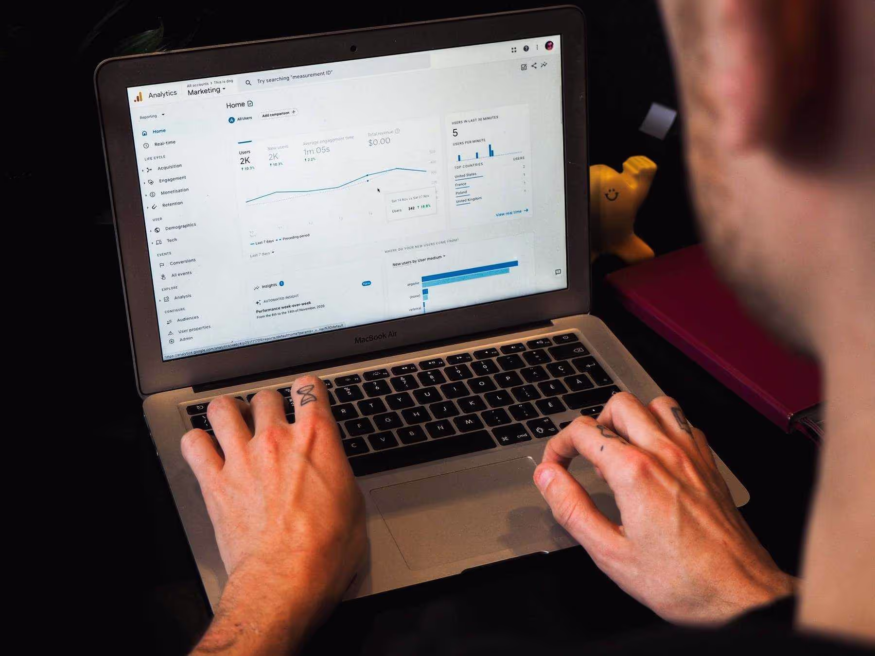
Source: Unsplash
#2 Finding usability issues and bugs
When it comes to the reasons why people visit your site, it’s simple – they click through to find what they came for (either a service or information), quickly and intuitively. If you’ve noticed that a page of yours has an alarmingly high bounce rate, it’s worth setting up a heat map for further investigation. Some of the usability problems you can notice on your heat map include:
- wrong clicks (i.e. visitors clicking on elements they think are hyperlinked, but are not)
- rage/error clicks (broken links)
- people not scrolling far enough down to read your content (i.e. low scroll rates)
#3 Boosting conversion through better CTA and content placement
Understanding on-site activities will also help you better tailor your messaging and optimize content element placement. If you use a scroll map, you’ll be able to understand how far down the page visitors browse, on average. If you see that just a quarter of people look anywhere below the fold, you’ll know that you should either work on your messaging or layout to encourage further content exploration.
Respectively, if you’re experiencing low conversion rates, a click map might indicate that people are distracted before they see the CTA. Perhaps they’re more drawn to a promotional banner than to your “sign up for free” button?
These are just a few of the advantages you can expect to gain from. If you’d like to learn more about the other ways that heat maps can assist you, refer to our dedicated piece on the benefits of using a heat mapping tool.
Best practices & mistakes to avoid when creating a heat map
Now that you know the benefits of using heat maps, it’s time to take a look at some best practices.
Decide which pages to place your heat map on
If you’re thinking about placing a heat map on every page, you may want to reconsider your approach. Pick those that are most crucial for your business and attract the most traffic. While the homepage probably seems like an obvious choice, we also recommend diving into your Google Analytics to identify the most suitable candidates.
Know what you want to verify
To find solutions to your problem, you firstly need to know what challenge you want to address. Is a high cart abandonment rate what leaves you sleepless at night, or maybe the fact that only 20% of visitors scroll to the bottom of your page? Whatever it is, agree on your objectives before creating a web heat map.
Supplement your heat maps with session recordings
Even though heat maps constitute a great data mine and can point out major issues on your website, unfortunately they won’t tell you the ‘why’ behind the problem. For this reason, we recommend using them together with session replays, which will show you what users do on your site. After watching a few recordings, you’ll find out exactly what the problem is. If you’re searching for a heat map tool that offers both heat maps and session recordings then check out LiveSession – we offer a free trial.
It’s normal to make mistakes when creating heat maps, so, to make it a little easier for you, we will discuss the most common ones so you can avoid them in the future.
Drawing conclusions too early from your web heat map
It is tempting to start making changes on your website right after gathering a few insights from your web page heat map, but try not to do this too early in the process. To draw credible conclusions you have to collect a sufficient amount of data, which means enough users must visit your site. Otherwise, your results won’t be statistically relevant, and your conclusions will be based on just a few users’ behavior.
Relying solely on heat map findings
As mentioned above, you cannot rely only on the data you get from heat maps. Support it with additional actionable insights – conduct user surveys, hold in-person interviews, or turn to session recordings, etc. The more meaningful insights you collect, the easier it will be for you to draw meaningful conclusions and come up with actionable solutions.
Not blocking your IP
Remembering that blocking your IP is important, especially if your organization is large. If a lot of visitors that enter your site are employees, the data you gather will be irrelevant.
If you’re hungry for more info about creating a heat map online with additional mistakes to avoid and best practices to follow listed, check out this article.
Improving your website with heat maps – three key pages explained
You may now be wondering “what exactly should I keep an eye out for on my homepage, blog, and other key pages?” Let’s discuss how to leverage heat maps on each of those pages below.
Homepage & landing pages
In many cases, your homepage is the first place visitors come across on your site. And you know what they say – you can only make a first impression once, so it better be a good one.
The same goes for landing pages, which can be discovered via Google searches. It’s worth setting up a heat map on landing pages for products and your marketing/sales campaigns.
Among others, a homepage heat map will assist you with:
- Better CTA placement - a heat map will indicate the “hot” (i.e. most noticed) parts of your page, which make great candidates for your buttons.
- Removing confusing or distracting elements - are people clicking on unlinked elements? Perhaps, that’s why they are getting frustrated and bouncing from your site. You’ll also be able to notice elements that unrighteously “steal the show”, i.e. draw visitors’ attention away from critical “buy now” or “sign up free” buttons
- Trial various messaging- observe how a change in your value proposition of CTA affects user click rates or scrolls. As we discuss further below, you can do this jointly with an A/B testing tool.
Blog
Your blog also deserves attention – it’s where you can establish yourself as an expert and convert many of your prospects into leads.
In the case of your blog, we recommend:
- Looking at scroll rates- this will tell you if people are actually reading your content and where they drop off. Bear in mind that “just” creating good content won’t suffice. Your blog must also be pleasing to the eye to encourage visitors to keep reading.
- Checking if people see your buttons such as newsletter signups - if your analytics tool says people don’t subscribe to your newsletter, check if the buttons or forms are placed in “hot” areas on your page.
You can read more on various heat map uses in a dedicated section of this guide.
Experts share the UX improvements they have achieved with heat maps
With the theory now covered, it’s time for some real-life examples from the market. We’ve asked a few experts to share what user experience improvements they were able to achieve by using web page heat maps. We share a few of them below (you can find the full list in a separate chapter on website experience and UX improvements).
#1 An 8% drop in bounce rates
Chris Anderson, Owner and SEO Analyst at My Five Guide, shared with us that heat maps helped him create a smarter and more user-friendly web design. After setting up a heat map on their homepage, Chris noticed that users weren’t scrolling to the “Popular Posts” section.
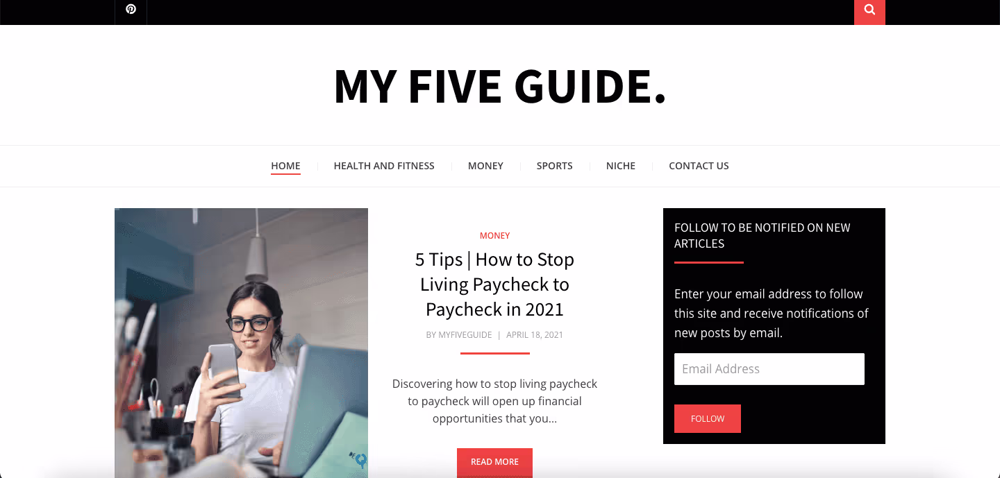
Source: My Five Guide
To solve the issue, he decided to move the section to a hotter, i.e. more visible area which made it easier for users to find. As a result, Chris noticed a quite abrupt, positive change in user session length. The best part, however, is that the change resulted in an 8% drop in bounce rates, and the “Popular Posts” section now gets 17% more notices from visitorsChris concludes that setting up the heat map online allowed him to find the issue in the website architecture that was hindering the overall results.
#2 A 23% higher conversion rate from the homepage thanks to website experience improvements
Kristian Borghesan, Director of Marketing at Savology, an online financial planning platform, says that he frequently turns to heat maps to spot the most important user interaction points and come up with solutions for optimizing the website experience. By placing a heat map on their homepage, they identified areas where visitors spend 80% of their time without taking any action. To increase engagement they reorganized their content sections and introduced new CTAs. This resulted in their conversion rate increasing by 23%.

Source: Savology
#3 Nearly 2x longer user sessions
John Ross, CEO at Test Prep Insight, a US-based online education company offering exam test prep reviews, says that more often than not website conversion rate optimization is like walking in the dark – you’re unsure where you’re going. This can be changed by using heat maps. John built two separate landing pages with inverse layouts and ran a heat map test after thousands of users had visited the page to see where they clicked, scrolled, and dropped off the page. Thanks to the insights collected, they came up with the idea to create a page that would combine elements from both variants and decided to run another test. The results were fabulous – the initial session duration prior to the redesign was 1 minute 6 seconds, which increased to 1 minute and 53 secondsafter implementing the changes. Well worth the effort.

Source: Test Prep Insight
#4 A 9% higher conversion rate thanks to improving the content layout
Alex Willen, owner of the e-commerce store Cooper’s Treats, shares yet another impressive heat map result.
When Alex first set up a web heat map, he was surprised to see that people were scrolling all the way to the footer and clicking on “Our Mission”. As the Cooper’s Treats team found out, people who read the mission webpage were 14% more likely to place an order than those who went straight to product pages. They understood that their target customer was interested in company values, so they moved the “Our Mission” link right to the top menu.
The results? After 30 days, the conversion rate grew by 9%. Also, visits to the "Our Mission" page increased by over 200%, with those clicking through more likely to finalize their purchases.
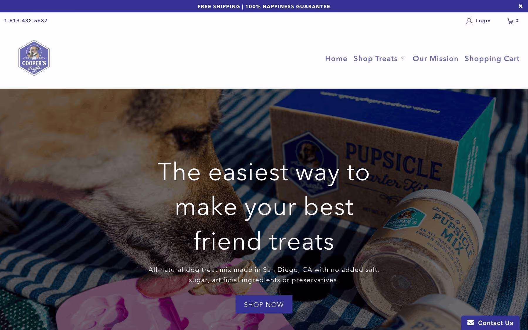
Source: Cooper’s Treats
Hopefully by now you’re ready to roll up your sleeves and see how setting up a heat map can also help your business. Before you dive in, however, a few words on how you should analyze your heat maps to make sure you can achieve the tangible results you’ve read about in this section.
How to make sure you properly analyze your heat maps
Time to discuss how to analyze your heat maps. Below are a few steps you should follow to ensure you’re reading them properly and drawing the right conclusions.
Assuming you’ve previously selected a few pages and set up heat maps on them, you should focus your analysis on:
- Heat map colors.- as mentioned earlier, areas that get the most engagement are marked with “hot” colors such as red, orange, and yellow. That’s where you should place the critical elements and information that you want to get noticed. On the other end of the spectrum are greens and blues, which show where people don’t look at all.
- Clicks - a heat map tool like LiveSession lets you see both heat map colors and clicks for each site in one view. By looking at your heat map results, ask yourself:
- Where do people click the most? Are any of them non-clickable elements?
- How many clicks do the various CTAs get? Do your conversion-related dynamic elements get more clicks than those of lesser business importance?
- Are there any rage clicks? If so, chances are you have an error on your site which is hurting your usability immensely.
- Scrolls- where do people stop browsing down to? Are there any products or CTAs that you’d like to get noticed in the “cold” parts of your webpage?
This is just a quick overview – you can read more on heat map analysis in a separate chapter of this guide.
Before you jump all in though, there’s also one more thing you must be aware of – avoiding bias. Heat maps tell you a ton about how people interact with your site, but they might not be able to tell you why. That’s why you should supplement your insights with data from other software, which is what we will get into below.
How to use heat map software with other tools
Let’s take a look at the tools that you can turn to to further enrich your data, starting with session recordings.
Session recordings
Believe us when we say that you can’t effectively use heat maps without session recordings. You probably want to know why, and that is because heat map data comes in large volumes and is anonymous. While they’re a great tool for identifying problematic areas, heat maps won’t tell you why the issue occurs. You have to dive deeper, and that’s exactly what session recordings let you do. Check out LiveSession if you need a platform that combines the two.
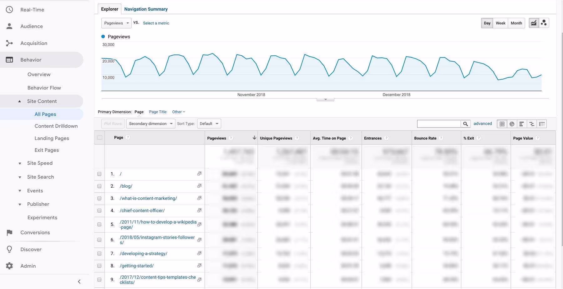
Website analytics
Website analytics should always be your starting point prior to setting up a heat map. Not only will you be able to decide which pages to place them on based on such stats like conversion rate, traffic, and bounce rate, but you’ll also be able to check how the changes you implement impact the initial stats. Has your conversion rate gone up, and is the bounce rate lower? We highly recommend using Google Analytics.
Source: CMI
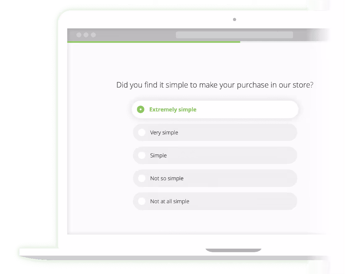
Website feedback
Heat map data is quantitative, so it’s always worth supplementing it with qualitative data that can be collected via surveys. Only then will you be able to get a whole picture of the issue. You can either email your customers asking them to fill out surveys or place one on your website for visitors to answer. You can turn to Survicate to collect user feedback - it offers multiple surveying options and has various integrations, including one with LiveSession.
Source: Survicate
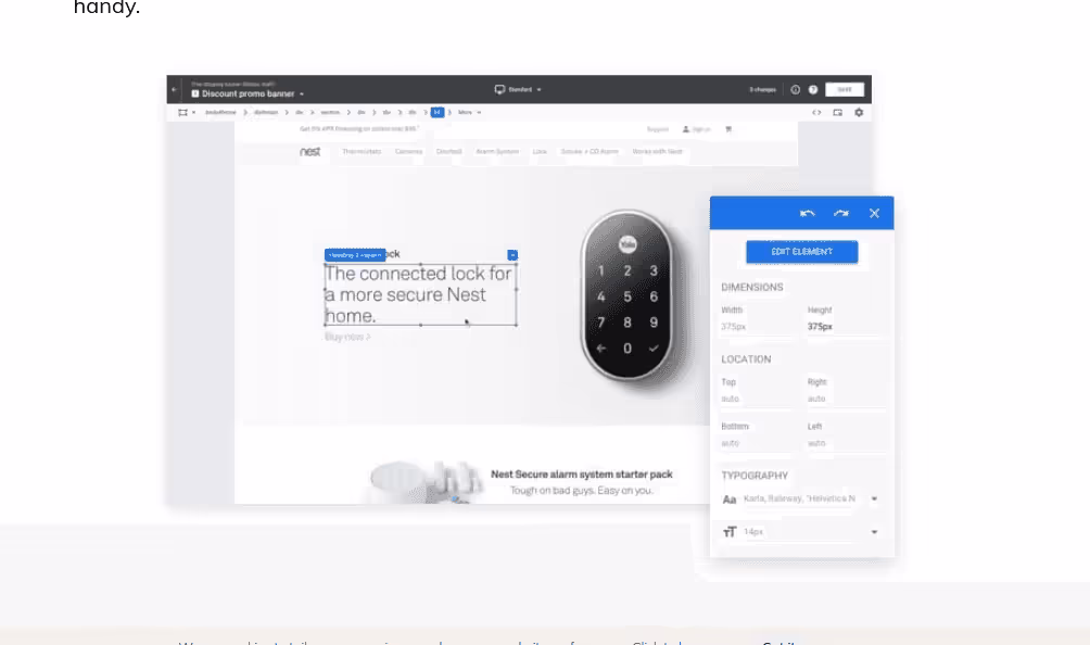
A/B testing tools
After getting results from your heat maps, you may come up with a solution or two. To check which one is best, you can use A/B testing tools. For instance, you might identify that your copy is the reason behind your low conversion rate. If so, you can test different variants to check which one performs best. If you’re on the lookout for an A/B testing tool, then you might want to consider Google Optimize. It quite handily integrates not only with LiveSession, but also the entire G-Suite.
Source: Google Marketing Platform
Summary
If you want to make sure that your website is user-friendly and optimized for conversion, you’ll love what heat maps bring to the table. There are a variety types of heat maps that you can use to gain insights – from general, color-based ones all the way through to scroll, click, and move maps. We dive into these various options in the next chapter.
When you first decide which pages to set up heat maps on, consider those that are crucial from a business perspective – e.g. homepage, pricing, blog, or any important landing pages. To draw the right conclusions, we also highly recommend using them jointly with other tools including A/B testing software, customer surveys, and website analytics, just to name a few.
LiveSession is unique on the heat map software landscape, as it offers users a 3-in-1 view of user activities – you can see a heat map, clicks, and every user’s session recordings on each page. You can try it out for free here and use what you’ll learn later on in this guide to deliver the best results.