
User Flow Mapping: 4 Validation Checks Product Teams Need

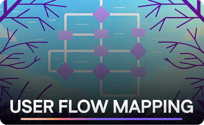
A user flow map is a task-level diagram of screens, actions, and decisions that teams use to design and audit a single user goal, like completing checkout or finishing onboarding. It stays narrow on purpose: one persona, one objective, every branch labeled. If you’re weighing whether to draw one right now, the process below gets you from blank canvas to a validated diagram your engineering team can build from.
What Is a User Flow, and Why Scope Matters
A user flow is a diagram that maps every screen, action, and decision point a user encounters completing one specific task. It has a defined entry point, a spine of steps, decision diamonds where the path branches, and one or more endpoints. A user flow differs from a journey map in scope: a flow covers a single feature-level task, while a journey map spans days or channels.
The rule that keeps a flow useful is “one goal, one persona.” The moment you try to capture two user types or two objectives on the same canvas, the diagram turns into a tangle nobody wants to open twice. Keep it narrow, and it stays a working document instead of wall art.
A user flow is the right artifact when you need to:
-
Design or redesign a specific feature (checkout, signup, a settings change)
-
Audit an existing flow for drop-off or confusion before a redesign
-
Hand off precise screen-by-screen logic to engineering
-
Align a cross-functional team on exactly what “done” looks like for one task
User Flows vs. Journey Maps, Task Flows, and Wireflows
Four artifacts get confused constantly, and picking the wrong one wastes a workshop. A user flow maps screens and decisions for one task. A journey map maps actions, thoughts, and emotions over a longer timeframe, often across multiple channels and touchpoints. Journey maps also include an actor, a scenario, phases, mindsets, and emotional highs and lows, which a user flow deliberately leaves out. A task flow is a stripped-down version of a user flow with no branching, just the single ideal path. A wireflow adds actual screen wireframes into the flow’s boxes, useful once you’re past the abstract stage and need to show stakeholders what each step looks like.
Here’s the one-sentence rule: if you’re mapping emotion and context over time, draw a journey map; if you’re mapping screens and decisions for one task, draw a user flow.
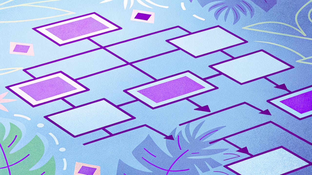
Pro Tip: If a stakeholder asks for a “customer journey” but only wants to see the checkout screens, they’re actually asking for a user flow. Clarify before you start drawing, or you’ll redo the whole thing.
A quick mental example: a journey map for buying a car covers research, dealership visits, financing anxiety, and post-purchase regret. A user flow for the same product only covers the “add to cart, choose financing, confirm” screens inside the site.
When to Use User Flow Mapping in the Product Lifecycle
User flow mapping earns its place at four specific moments:
-
Feature discovery. Before wireframes exist, a rough flow forces the team to agree on scope and decision points.
-
Pre-prototype checks. Once a flow is drafted, walk it with stakeholders before a single screen gets designed in high fidelity.
-
Engineering handoff. A detailed flow with every branch labeled prevents the “wait, what happens if the payment fails?” conversation from happening in a sprint review.
-
Funnel audits. When conversion data shows a drop, mapping the existing flow (not the ideal one) exposes where the design and the real behavior diverge.
Teams tend to start hypothesis-first, sketching the flow from assumptions to get quick alignment, then validate with research afterward. Following up a hypothesis-first map with real research tends to sharpen its accuracy, rather than replacing the draft outright. Either way, the exercise forces design, engineering, and support to agree on the same picture before code gets written, which cuts down on the rework that shows up three sprints later.
How to Map a User Flow, Step by Step
Here’s the process, in order. Skip a step and you’ll feel it later, usually in a bug report.
1. Title the flow with a persona and a measurable goal. “New user completes signup” beats “Signup flow.” The persona and the goal define the boundary of everything that follows.
2. Fix the entry point and write down your assumptions. Does the user arrive from a marketing email, a homepage button, or an app store install? Different entries sometimes mean different starting states (logged out vs. returning), and assuming one entry point when there are three is a common source of missing branches.
3. Draw the happy path first. This is the spine: the shortest sequence of screens and actions where nothing goes wrong. Resist the urge to add decisions yet. Get the ideal path down as a clean line of boxes and arrows.
4. Add decision diamonds and label every exit. Every diamond needs at least two labeled arrows out of it. Unlabeled branches are the most common readability bug in team-drawn flows, and they’re the first thing a new team member will get stuck on.
5. Add edge cases and error loops. This is the step most teams shortcut, and it’s the one that matters most. Password reset failures, payment declines, expired sessions. Missing error paths at this stage are a direct cause of support tickets and post-launch rework, so treat this step as mandatory, not optional polish.
6. Split into sub-flows once the diagram gets dense. A single canvas trying to hold the happy path, five decision points, and eight edge cases becomes unreadable. Link out to a sub-flow for “payment decline recovery” instead of cramming it into the main diagram, and keep the zoom level consistent within each frame: page-level flows for discovery conversations, detailed screen-level flows for engineering handoff.
7. Walk the flow out loud with engineering and support. Read every path as a sentence: “If the card is declined, the user sees an error and returns to payment entry.” Saying it out loud surfaces gaps that looking at boxes never does. Iterate before you call it final.
Pro Tip: For high-stakes flows like checkout or password reset, map the error and recovery paths before you polish the happy path visually. Those branches cause the largest conversion losses, and they’re the ones stakeholders forget to ask about until launch week.
Notation Rules That Keep a Flow Readable
A small, consistent shape set does more for clarity than any amount of visual polish. Standard flowchart notation adapted for product work usually comes down to four shapes:
-
Ovals mark start and end points (entry and endpoint).
-
Rectangles represent screens or actions the user takes.
-
Diamonds represent decisions, always with two or more labeled exits.
-
Arrows show direction; never leave one unlabeled if it exits a diamond.
A few practices separate a usable flow from a confusing one. Keep the happy path visually dominant, thicker line or a distinct color, so anyone glancing at the diagram can trace the main route in three seconds. Use color sparingly and consistently: one color for error states, one for the happy path, and stop there. Never mix zoom levels on one canvas; a page-level overview and a field-by-field validation flow belong in separate, linked frames. When you export or share, version the file name with a date and keep the “living” draft in your team’s shared workspace so the flow gets revisited rather than frozen the day it’s drawn, a habit the Gov recommends for experience maps too.
Signup, Checkout, and Onboarding: Flows Worth Studying
These three flows show up in nearly every product, and they share a pattern: the happy path is easy to draw, and the edge cases are where teams get burned.
Signup. Map the happy path (enter email, verify, land on dashboard), then add three decision nodes: is the email already registered, did verification succeed, and did the user close the tab before finishing. Two edge cases worth tracking: duplicate account attempts and password recovery mid-signup.
Checkout. The happy path is: cart, shipping, payment, confirmation. Decision nodes: guest vs. returning customer, payment approved vs. declined, and address validation. Edge cases: what happens to the cart if the session expires, and how a declined card routes back into the flow without losing the order details.
Onboarding. Map the activation moment as your endpoint, not “tour complete.” Decision nodes: does the user skip the tour, is there existing data to import, and did the user reach the first meaningful action. Edge cases: empty states with no data yet, and users who skip every step and land on a blank dashboard.
Pro Tip: Treat “empty state after skip” as its own edge case in onboarding flows. It’s the single most common dead end teams forget to design for.
How to Validate That Your Flow Actually Works
A drawn flow is a hypothesis. Confirming it holds up in the real product takes four checks, roughly in order of speed:
-
Read-aloud walkthrough. Get design, engineering, and support in a room and narrate every path out loud before anything ships.
-
Targeted usability tests. Don’t test the whole flow; test the two or three decision points you’re least sure about.
-
Funnel and drop-off analysis. Step-by-step conversion metrics show exactly which node in your diagram is losing people.
-
Session replay and heatmaps. Watching real sessions surfaces the branches users actually take, including ones you never drew.
Collaboration tends to matter more than most teams assume: Many practitioners report creating mapping artifacts like these collaboratively rather than in isolation, which tracks with why the walkthrough step above works better with a full room than a solo review. Session replay in particular tends to catch what prototypes hide: a tool like LiveSession can reproduce the exact click path a frustrated user took right before abandoning checkout, which is a branch no one thought to draw.
Which Tools Should You Use to Draw a Flow?
Pick the tool based on your team’s existing workflow, not the tool with the most features. FigJam fits teams already living in Figma, since flows can link directly to the actual screens they represent. Whimsical works well for fast, auto-connecting flows when you want speed over polish. Miro handles large cross-functional workshops best, especially when a dozen stakeholders need to add sticky notes to the same canvas at once.
Whatever canvas you choose, keep individual pages small. A page-level overview flow should stay legible on one screen; anything that needs more detail gets its own linked sub-flow. Teams working in code-heavy environments sometimes prefer a text-based tool like Mermaid, since diagrams-as-code can live in version control alongside the product itself, which solves the “which version is current” problem that visual tools struggle with.
For a broader look at how these tools connect to analytics platforms, customer journey mapping tools worth comparing often integrate directly with session data, closing the loop between what you drew and what users actually did.
How Session Data Confirms What Your Flow Diagram Predicts
A flow diagram tells you what should happen. Session replay and funnel data tell you what does happen, and the gap between the two is usually where the real product work lives. Some analytics platforms combine those views: session replay to watch individual paths, funnel reports to see where a cohort drops off, and heatmaps to see where clicks cluster relative to the decision points you drew.
-
Replay reveals which branches real users actually take, including ones missing from your diagram entirely.
-
Funnels show the exact node where drop-off spikes, so you’re not guessing which decision diamond needs redesign.
-
Heatmaps confirm whether users even notice the button your happy path assumes they’ll click.
-
Built-in GDPR and CCPA compliance means this validation can happen without adding legal risk to the product.
Teams often discover an entire edge case they never mapped, like users repeatedly hitting “back” during payment, only after watching replays of the flow they thought they’d already finished.
A Quick Checklist and Three Red Flags
Before you call a flow done, run this checklist: one goal stated in the title, every diamond has labeled exits, every path ends at a real endpoint, and edge cases are drawn, not assumed. Three red flags to catch in review: an unlabeled branch, an orphan node with no incoming arrow, and mixed zoom levels on one canvas. None of these are fatal, but each one causes a real conversation three weeks later. Pair the finished map with live session playback before you trust it. A diagram tells you what should happen; a recording tells you what did.
— Tymek
Get Started Validating Flows With LiveSession
Once your flow is drawn, the real question is whether users actually follow it. Some analytics platforms close that loop with session replay, funnel reports, error tracking, and heatmaps built specifically to confirm which branches real users take and where they drop off instead.
Teams request a demo when they need to reproduce a specific edge case fast, a payment decline loop, a confusing decision point, and measure whether a fix actually moved the number. The clickmap and heatmap toolset shows exactly where attention lands relative to the decision points in your diagram, so you’re comparing the flow you drew against the one users are living. Reviewing UX through this lens also tends to pay off in organic search performance, since flow friction and bounce often move together. If you’ve got a flow mapped and want to see whether it holds up, start a LiveSession trial and run your next validation on real sessions instead of assumptions.
Sources
Related articles
.png)



Get Started for Free
Join thousands of product people, building products with a sleek combination of qualitative and quantitative data.