
Website Friction Signals: What They Are and How to Find Them

.png)
Nobody files a support ticket because a button took two seconds too long. They click it twice, wait, and leave. The revenue is gone and the only record of it sits in behavior nobody was watching.
Friction signals are how you catch that. They are the small, measurable behaviors that show a user hitting resistance, and they arrive well before a complaint, a churn event, or a drop in your conversion rate. This guide covers which signals to track, how to set thresholds, and how to trace a signal back to a cause.
What is website friction?
Website friction is anything that makes it harder for a user to do the thing they came to do. Slow load times, confusing navigation, forms that ask too much, unclear labeling, and interfaces that behave differently from how they look all qualify.
The word borrows from physics, where friction resists motion. On a website the resisted motion is progress toward a goal, and the cost is measured in people who stop moving.
Friction is rarely dramatic. A single hesitation, a misread label, or an extra step that felt unnecessary will each shed a small percentage of users. Those percentages compound across a user journey, which is why a site can lose most of its traffic through a series of small moments of friction that no individual person would describe as a problem.
What is a friction signal?
A friction signal is an observable user behavior that indicates resistance. It is the evidence layer underneath the concept.
Friction itself is an experience, and you cannot measure an experience directly. What you can measure is what people do when they encounter it: click something twice, click something that does nothing, go back to the page they just left, abandon a form halfway through.
Each of those behaviors is a signal. On its own a signal proves nothing, because users do odd things for ordinary reasons. In aggregate, and concentrated on one element or one step, a signal becomes a finding.
The useful property of behavioral signals is timing. Bounce rate, support volume, and conversion decline all tell you about friction after it has already cost you something. Friction signals fire at the moment of resistance, which gives you the chance to fix the cause before the damage accumulates.
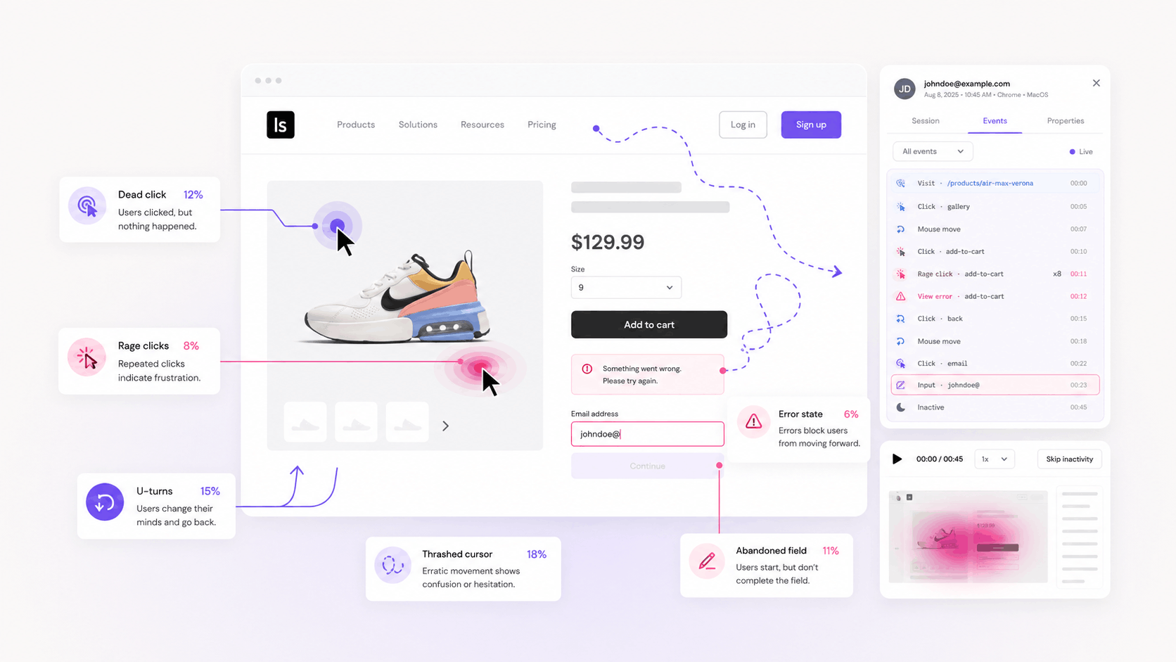
The friction signals worth tracking
Dead clicks
A dead click occurs when a user clicks an element and nothing responds. No navigation, no state change, no feedback of any kind.
This is the earliest signal in the set, and the quietest. It happens when something looks interactive and is not: an underlined phrase, a styled heading, a card with a hover shadow, an icon with no handler attached. The user formed an expectation from your visual language and the interface declined to honor it.
Dead clicks matter because they precede everything else. A user who dead clicks and finds the real link a second later costs you nothing. A user who dead clicks and gives up costs you a conversion, and the two look identical until you watch what happened next.
Rage clicks
A rage click is a burst of rapid clicks on the same element in a short window. The user already tried once, got nothing, and escalated.
Most teams track rage clicks first because they are vivid and easy to explain to stakeholders. The trap is that a rage click is a late signal. By the time someone is clicking a button five times, they have already spent their patience, and the same problem was visible as a dead click several steps earlier.
Track both, and treat the ratio between them as diagnostic. An element generating many dead clicks and few rage clicks is confusing. An element generating both is broken.
Error clicks
An error click is a click that triggers a JavaScript error. Something did happen, and it failed.
These are the most actionable signals in the set, because they come with a stack trace. A checkout button throwing an error on one browser version is a defect with an owner, and the fix does not require a debate about design intent.
Error clicks also tend to cluster on the highest-value steps, since those are the steps with the most complex logic behind them.
U-turns
A u-turn is a user navigating to a page and immediately returning to where they came from. It signals a mismatch between what the link promised and what the page delivered.
Concentrated u-turns on a navigation item usually mean a labeling problem. People clicked expecting one thing, found another, and reversed. This is cognitive friction rather than technical, and it will never show up in your error logs.
Thrashed cursor
A thrashed cursor is rapid, erratic mouse movement in a small area. It correlates with confusion and with waiting, and it often appears in the seconds before a rage click or an exit.
On its own this signal is noisy. Paired with a slow-loading element or a form validation step, it sharpens into something you can act on.
Form field abandonment
Field-level drop-off tells you which specific input ends a session. It is the most precise friction signal available for the step where most conversion loss happens.
Watch for fields that people start, clear, and start again. Repeated correction on one input usually means the format expectation is undocumented, and the fix is a hint or a mask instead of a redesign.
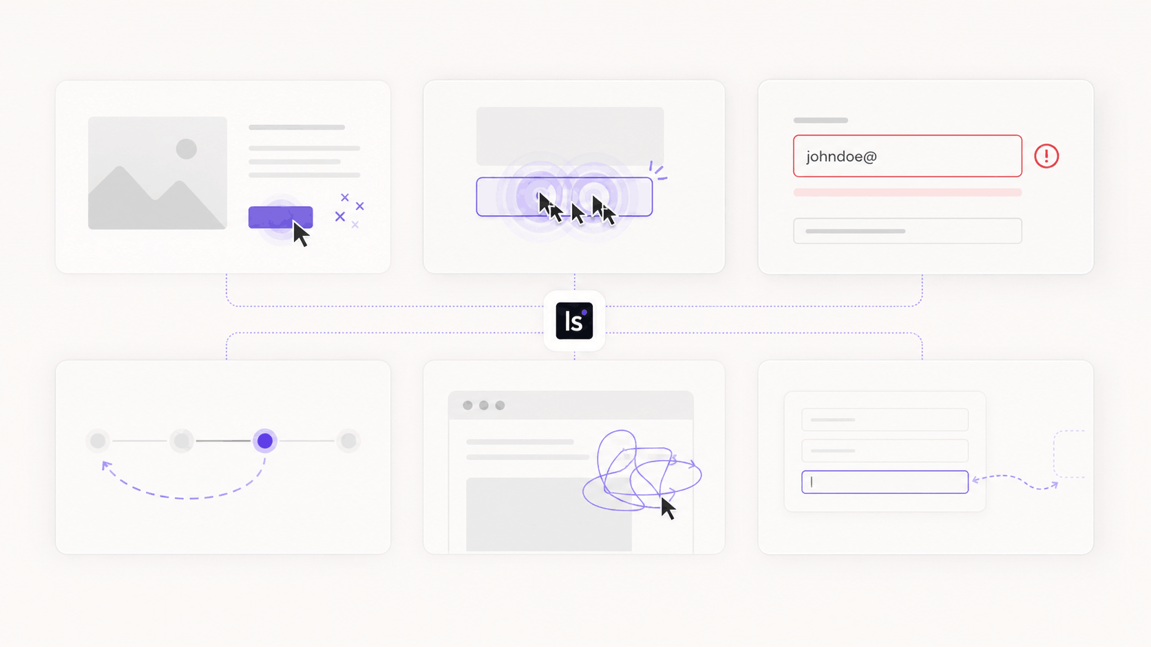
The four types of friction these signals reveal
Interaction friction is mechanical. The button does not work, the tap target is too small, the page has not finished loading. Dead clicks, error clicks, and thrashed cursors point here.
- Cognitive friction is comprehension. The user does not understand what to do, what a label means, or what happens after they click. U-turns and hesitation before an action point here, and this type is the most commonly missed, because the interface is working exactly as built.
- Process friction is structural. There are too many steps, the steps arrive in an illogical order, or the flow demands information before the user is willing to give it. Field abandonment and mid-funnel drop-off point here.
- Emotional friction is trust. Unexpected costs, a privacy policy interstitial that arrives at the wrong moment, or a form asking for a phone number when the offer is a whitepaper. Users abandon at these points while the interface performs perfectly.
- Separating the four matters because the fixes come from different teams. Interaction friction is an engineering ticket. Cognitive friction is a copy and design problem. Process friction requires someone with authority over the flow, and emotional friction is usually a business decision about what you ask for and when.
How to set thresholds so signals become decisions
Raw signal counts are close to useless. Every site generates dead clicks continuously, and a dashboard showing four thousand of them last month gives a team nothing to act on.
Convert counts into rates before you look at them. Dead click rate per page, expressed as the percentage of sessions on that page containing at least one, is comparable across pages of different traffic. The absolute count is comparable across nothing.
Set the threshold against your own baseline. There is no industry benchmark for dead click rate, and any number presented as one has been invented. Measure each page against its own history, and against pages of similar type on your own site. A signup form and a blog post produce different rates for reasons that have nothing to do with quality.
Weight by position in the funnel. Friction on a page after a user has demonstrated intent is worth more attention than the same rate on a page they landed on by accident. A checkout step at eight percent deserves more than a landing page at eighteen.
The last threshold is directional. A stable rate that has been stable for a year is a property of the page. A rate that doubled after Tuesday's deploy is an incident, and change detection catches problems that absolute thresholds miss entirely.
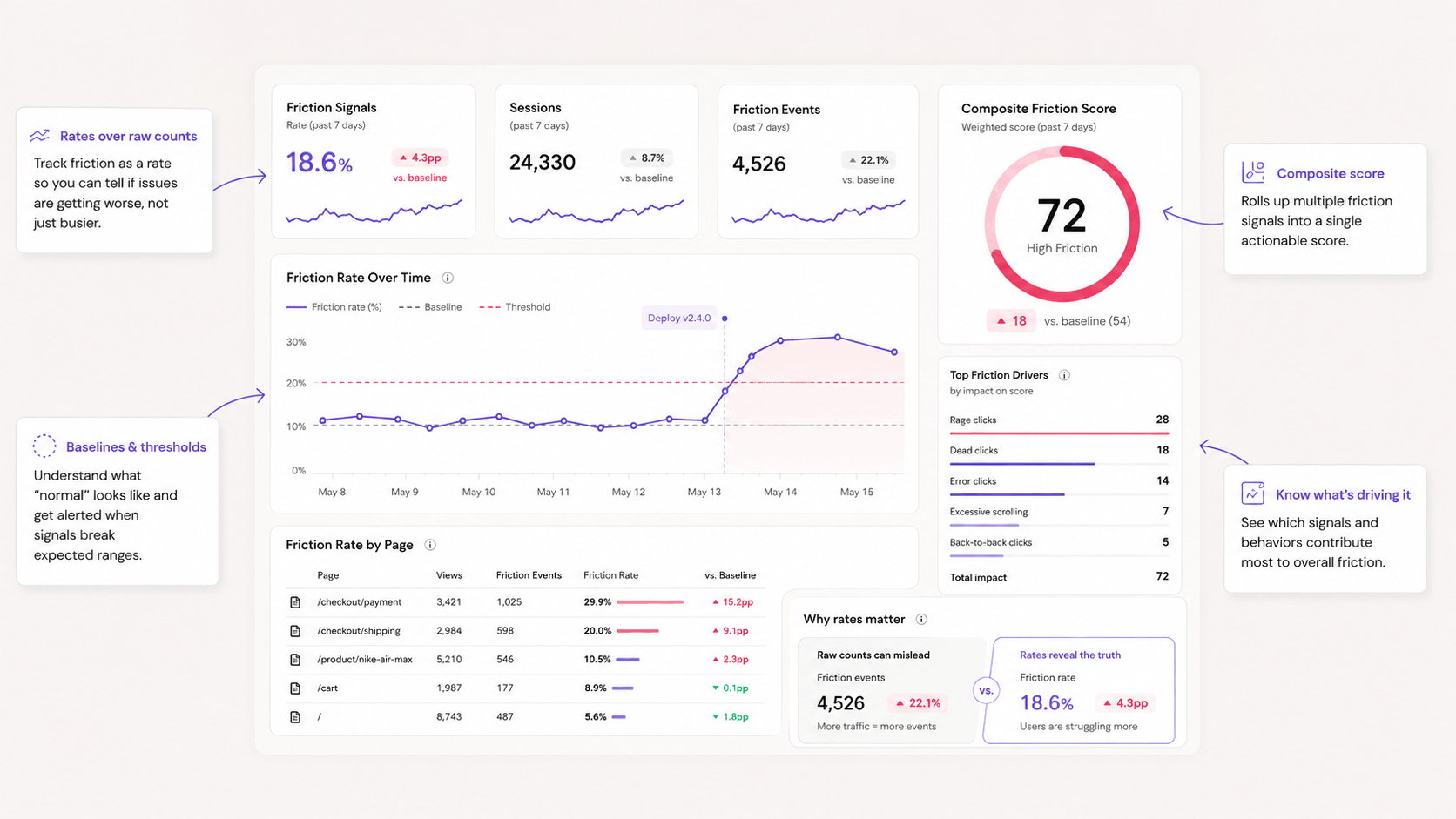
How to quantify friction with a composite score
Several analytics vendors offer a single friction score that combines signals into one number per page or per session. The appeal is obvious, since one number is easier to report and easier to trend.
The construction is usually a weighted sum. Each signal type gets a coefficient, the weighted signals are normalized against session volume, and the result maps onto a scale. Some implementations weight by proximity to an exit, so a rage click three seconds before someone leaves scores higher than one in the middle of a session.
A composite score works well for triage and poorly for diagnosis. It ranks your pages, which tells you where to look, and it hides which signal drove the score, which means you cannot act on it directly. Use it to sort, then open the underlying signals to decide anything.
Be careful with the trend line. A score that combines signals can stay flat while one signal doubles and another halves, and teams reading only the composite will miss both.
How to find the root cause behind a signal
A signal tells you where and how often. It never tells you why, and every hypothesis written from counts alone is a guess wearing a number.
Start by isolating the element. Element-level data turns "this page has friction" into a specific selector, which is the difference between a finding a designer can argue with and one an engineer can fix.
Then watch what happened. Session recordings filtered to the sessions containing the signal show you the sequence: what the user tried, how long they waited, what they did next. This is where a dead click on a heading turns out to be forty people trying to sort a table that has no sorting.
Heatmaps handle the page-level version of the same question. When clicks cluster on a non-clickable element, you are looking at a design affordance problem, and the aggregate view shows the scale that individual recordings cannot.
Segment before concluding. A signal that appears only on mobile devices, only in one browser, or only for returning users has a cause that the blended view averages into invisibility. Splitting by device resolves a surprising share of friction findings in a single step.
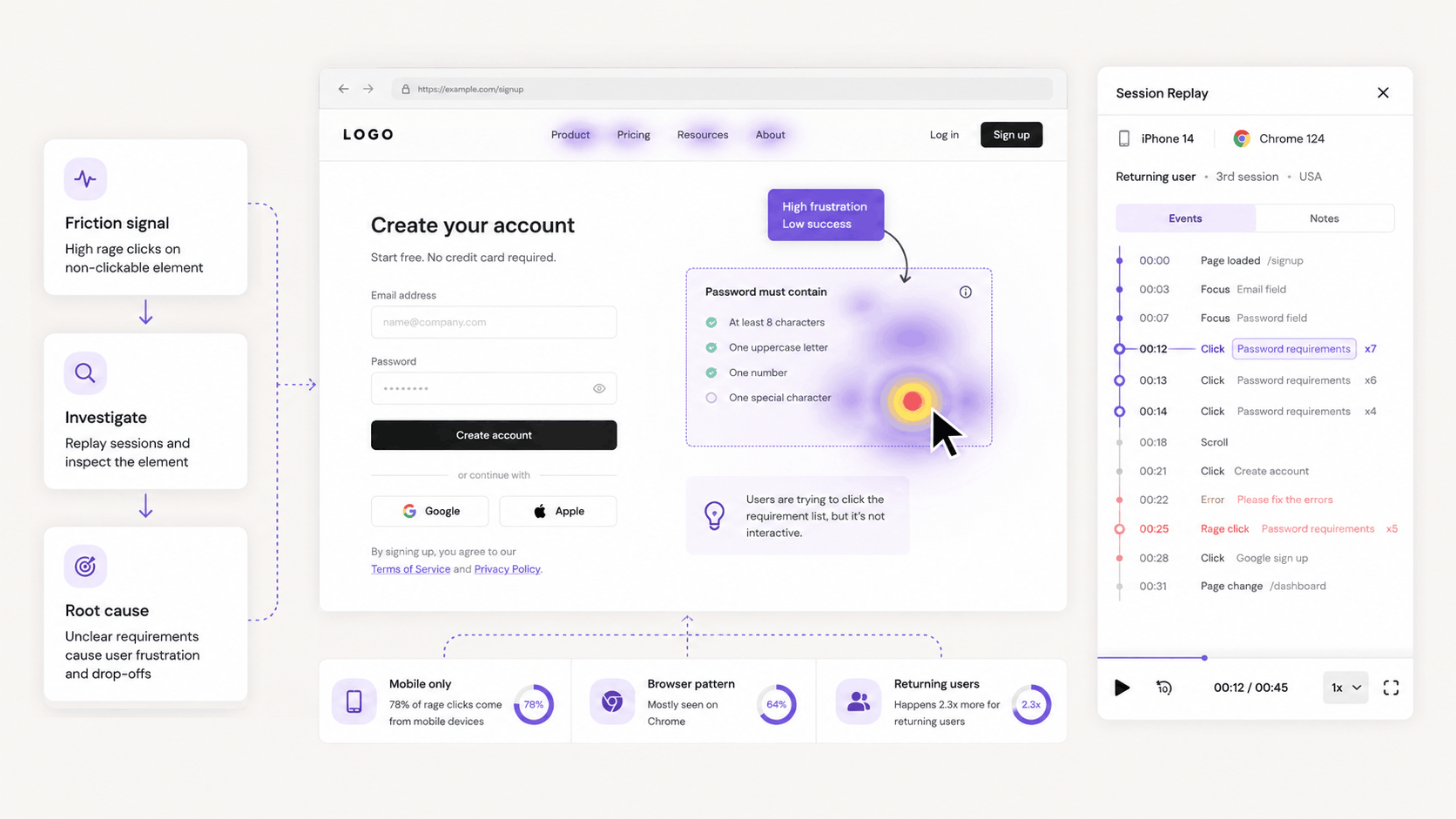
The last step is confirming the fix. Ship the change and watch the signal rate on that element, since a friction problem that has been solved stops producing the behavior. Where traffic allows, run it as an experiment so the improvement is attributable to the change instead of to the week it shipped.
Turn observations into hypotheses
A replay observation shouldn’t end with:
People seem confused.
Translate it into something testable.
For example:
Mobile users repeatedly click the product image because they expect an enlarged view. Adding image zoom may increase product engagement and add-to-cart actions.
Or:
Visitors return from checkout to the shipping page because delivery timing isn’t visible before checkout. Showing estimated delivery earlier may reduce abandonment. Replay findings can also make agency conversations more practical. If a team is evaluating B2B website design companies, bringing clear examples of form friction, confusing navigation, CTA hesitation, or mobile layout issues can help the future partner understand what needs to be improved before proposing a redesign.
This creates a clear connection between observation, proposed fix and metric.
Create a regular replay review
You don’t need someone watching sessions all day.
A focused recurring review can be enough.
For example, once per week the team may inspect:
- High-value funnel drop-offs
- Sessions containing serious errors
- Recent landing-page traffic
- New mobile problems
- Important product releases
Keep the review connected with current business priorities.
After a major redesign or campaign launch, increase monitoring temporarily.
Once the experience stabilizes, return to a lighter cadence. The same approach can be useful for other recurring marketing tasks. For example, teams can use RecurPost to plan and schedule social media content in advance, creating a consistent publishing routine without requiring someone to manually publish every post. This leaves more time for focused activities such as reviewing website behavior and acting on conversion problems.
When friction is worth keeping
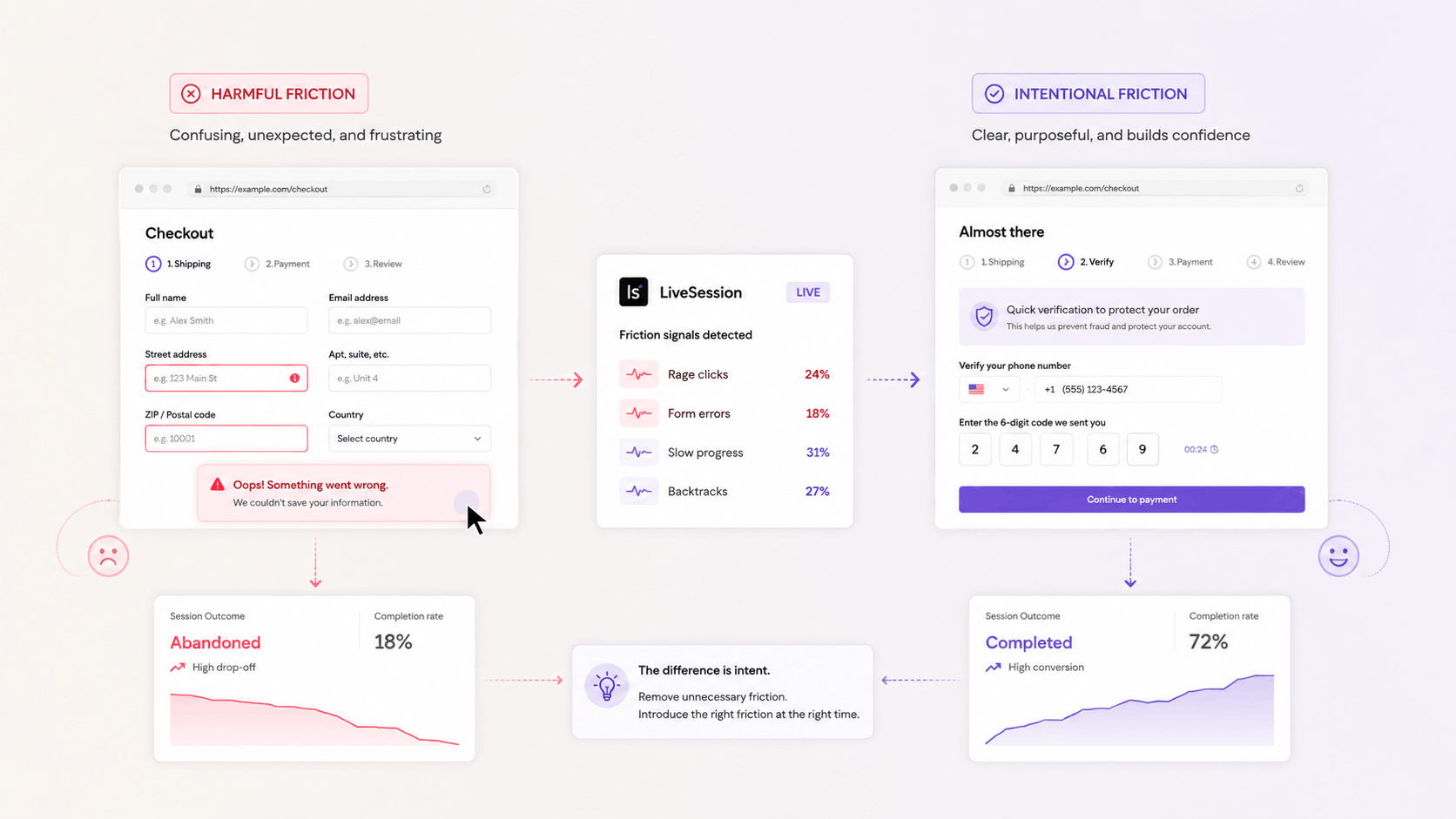
Not all friction is a defect, and removing every point of resistance produces its own problems.
Confirmation steps exist to slow people down before irreversible actions. Deleting an account, sending money, and publishing something public all benefit from a moment of deliberate resistance, and a frictionless version of any of them generates support volume instead of satisfaction.
Qualifying friction filters. A longer form produces fewer leads of higher quality, and teams optimizing purely for form completion sometimes discover they optimized for a sales team drowning in unqualified contacts. That trade-off hits hardest for lean teams and small businesses running on platforms such as zenbusiness, where a small sales pipeline can't absorb a flood of leads that go nowhere.
Effort also creates commitment. Onboarding that asks a user to configure something meaningful produces better retention than onboarding that skips every choice, because the configuration is what makes the product theirs.
The distinction is intent. Friction you designed, that the user understands the reason for, and that produces a better outcome is a feature. Friction that surprises the user and serves nobody is the kind these signals are built to uncover.
Common mistakes when measuring friction signals
Chasing every signal is the most expensive mistake. Users click on text to select it, click images expecting a lightbox, and click empty space to dismiss a field. A dead click on a paragraph in the middle of an article means nothing, and a team that treats the full list as a backlog will burn a quarter on noise.
Tracking one signal in isolation is the second. Rage clicks alone give you a late, partial picture, and the teams that get value from this data track the full set and read them against each other.
Setting thresholds from someone else's benchmark produces confident, wrong prioritization. Your rates depend on your traffic mix, your page types, and how much text you put on a page.
The last mistake is treating friction analysis as a project. A site changes continuously, and every deploy is an opportunity to introduce a new dead click on an element that worked last week. Signals are worth monitoring on a cadence, in the same way you monitor uptime. Teams using a release notes tool can make that review part of the release workflow, checking customer-facing changes for new friction as they go live.
Frequently asked questions
What are friction signals on a website?
Friction signals are observable user behaviors that indicate resistance, including dead clicks, rage clicks, error clicks, u-turns, thrashed cursors, and form field abandonment. They identify where users struggle before that struggle appears in your conversion data.
How do you measure website friction?
Measure friction by tracking behavioral signals as rates rather than counts, comparing each page against its own baseline, and weighting by position in the funnel. Complement these with time-on-task, bounce rate, and completion rates for the flows you care about.
What is a friction score?
A friction score is a composite metric that combines multiple friction signals into a single value per page or session, usually as a weighted sum normalized against session volume. It is useful for ranking pages by priority and insufficient for diagnosing what to change.
What is the difference between a dead click and a rage click?
A dead click is a single click that produces no response. A rage click is a burst of rapid clicks on the same element, typically after a dead click failed. Dead clicks are the earlier signal, and rage clicks indicate the user has already lost patience.
Can friction signals be tracked on mobile?
Yes, and mobile rates typically run higher than desktop. Small tap targets, overlapping elements, and sticky headers that intercept taps all generate friction signals at rates that desktop layouts do not produce.
Does AI help with friction analysis?
AI is effective at clustering sessions that share a behavior and summarizing what a group of recordings has in common, which compresses hours of manual review into minutes. It inherits your instrumentation assumptions, so it describes the friction you decided to measure and stays silent about the friction you did not.
How often should you review friction signals?
Review them monthly as a baseline, and after any release that touches a page in a conversion flow. Change detection matters more than absolute thresholds, since most new friction arrives with a deploy.
Your users are already telling you
Every dead click, reversal, and abandoned field is a message somebody sent before they left. The sites that read them fix problems while the fix is still cheap.
Related articles




Get Started for Free
Join thousands of product people, building products with a sleek combination of qualitative and quantitative data.