
Website Heatmap Analysis: How to Read User Behavior in 2026


A website heatmap can make a page look easy to understand.
There is a bright red area around a headline. The main call-to-action gets plenty of clicks. Users scroll almost to the bottom. It seems like clear proof that the page works.
Then conversion stays flat.
The problem is that heatmaps visualize activity, not intent. A click cluster may show interest. It may also show confusion. A deep scroll may suggest attention, but it can just as easily mean users are hunting for shipping information, pricing or a feature explanation that should have appeared much earlier.
That is why good website analysis starts with heatmaps but does not end there. The real work is learning what users were trying to do, where their journey changed direction and what stopped them from taking the next step.
This guide explains how to use heatmaps, when heatmap data can mislead you and how to pair it with session replay, funnels and web analytics to make better optimization decisions.
What is a website heatmap?
A website heatmap is a visual way to understand user behavior on a page. It uses colour intensity to show where users click, move, scroll or spend time.
The hotter the area, the more activity it received. Red and orange zones usually signal higher concentration. Cooler colours indicate lower interaction.
Most website heatmap tools offer several views:
- a click map that shows where users click or tap
- a scroll map that shows how far users scroll
- a move map that tracks cursor movement on desktop
- an attention view that estimates where visitors spend time
- a segmented view that lets you compare behaviour across different users
Heatmaps make patterns easier to see than a spreadsheet of event data. They can show that users ignore a primary CTA, repeatedly click a non-clickable image or stop scrolling before reaching a key page element.
That is useful. But heatmaps show what happened at scale. They do not automatically explain why it happened.
Why heatmaps can lead to the wrong conclusion
The biggest risk with heatmaps is treating activity as success.
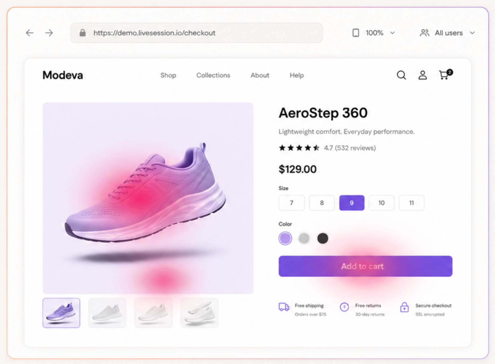
A button with many clicks may lead to a broken flow. A product image may attract clicks because users expect it to open a gallery. A pricing table may look popular because visitors cannot tell which option applies to them.
A heatmap can reveal where people paused, clicked or scrolled. It cannot confirm their motivation.
This matters because website optimization often starts with a rushed conclusion:
Users click here a lot, so we should make this section bigger.
Sometimes that is right. Sometimes the real issue is that the section looks interactive but does nothing. Making it bigger would only create more frustration.
To understand user behavior, start with several possible explanations for the same pattern. Then use session replay, funnel analysis and filtered recordings to test them.
What heatmaps can tell you well
Heatmaps are still one of the fastest ways to spot areas worth investigating.
They work especially well when you need to:
- visualize user activity on a landing page
- compare desktop and mobile behavior
- see if users click the intended CTA
- identify ignored page sections
- understand where people stop scrolling
- review interaction with filters, tabs or navigation
- find high-traffic pages that deserve closer UX work
- create a shortlist of pages for conversion optimization
A website heatmap tool is not a replacement for broader website analytics. It is a way to decide where to look next.
For example, standard analytics may tell you that a product page has a high exit rate. A heatmap may show that users interact heavily with the size guide, ignore the product description and rarely reach the reviews. That gives you a more useful starting point.
The next question is still open: do users fail to find the right size, distrust the product or leave because the page loads too slowly?
That is where deeper investigation begins. You can do a lot of the work yourself. If you don’t want to hire someone for conversion rate optimization services, these are the four steps to start with.
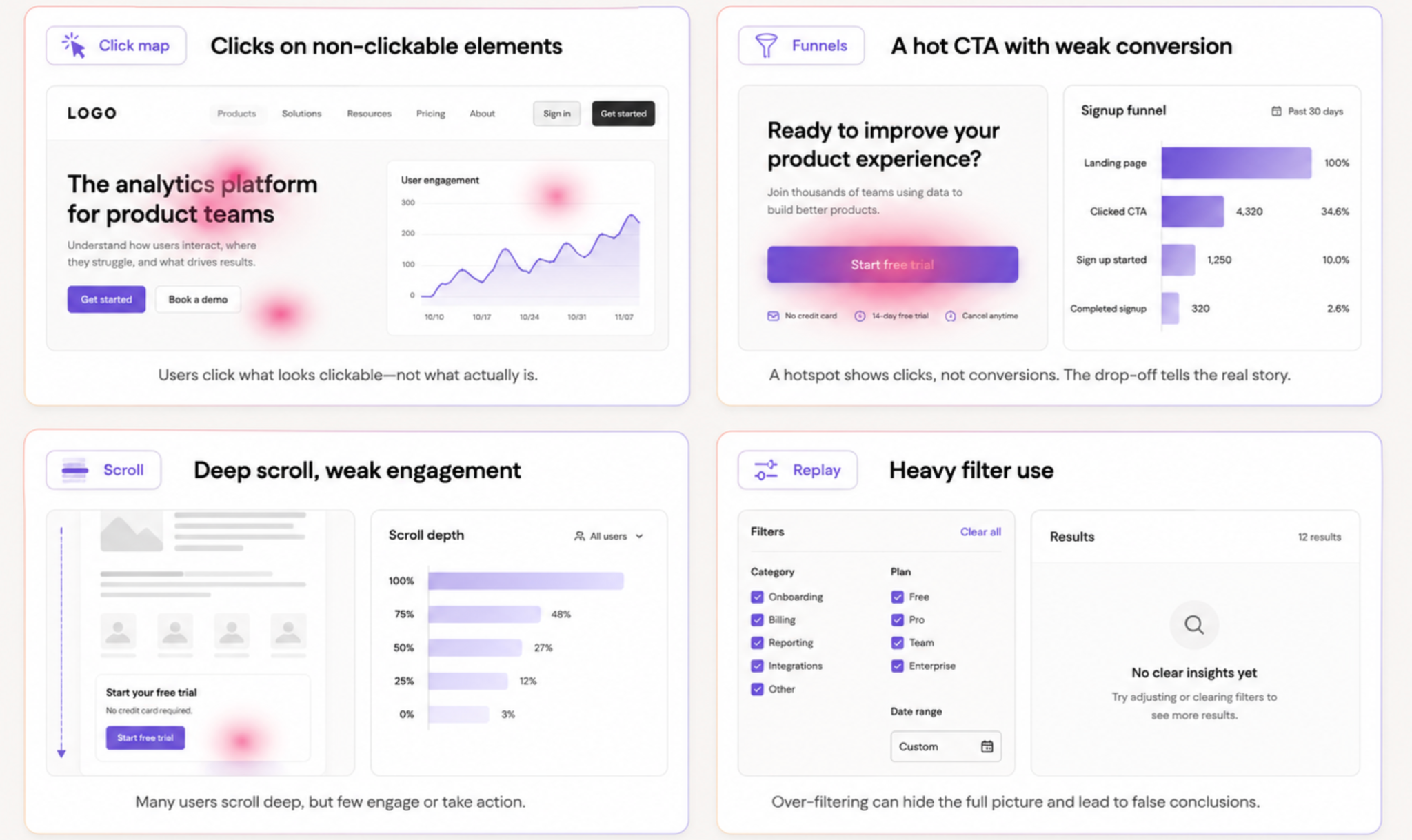
The four heatmap patterns that often mislead teams
1. High click activity on a non-clickable element
This is one of the clearest examples of a misleading click map.
Users may click a heading, a product image, a price, a feature card or an icon that looks like a button. A heatmap can make this look like strong engagement.
It may actually signal a design problem.
When users click a non-clickable page element, they often expect something to happen. Perhaps they want more information. Perhaps they assume the image opens a gallery. Perhaps the element looks too similar to a control used elsewhere on the page.
Do not immediately add a link or button. Watch a few recordings first.
Look for patterns:
- Do users click once and keep browsing?
- Do they click repeatedly in the same place?
- Do they move back and forth between the element and another part of the page?
- Do they leave soon after clicking?
- Does the issue appear mainly on mobile?
If the same behaviour appears across several recordings, the heatmap has found a real UX issue. You can then decide if the element needs to become interactive, look less interactive or include clearer supporting copy.
2. A hot CTA that does not improve conversion
A primary CTA can receive plenty of clicks while the page still fails to convert.
That may mean the call-to-action does its job but the next step does not. The form could be too long. A new screen might load slowly. Pricing could appear after the click. A technical error may block the flow.
Heatmaps help you notice that users click the CTA. Funnel analytics helps you see what happens after the click. Session replay explains what users do when the expected next step does not work.
For a deeper framework on turning recordings into evidence rather than anecdotes, see this guide to analyzing session recordings.
A good investigation sequence looks like this:
- Check the click map for the CTA.
- Review the funnel from CTA click to completed action.
- Filter session replay to users who clicked but did not convert.
- Watch enough recordings to find a repeated issue.
- Form a clear hypothesis.
- Test one change.
- Compare results after release.
This is much stronger than assuming that a hot CTA needs more contrast or a new position. And if you’re selling a high-ticket offer such as private health insurance in Australia, one single tweak can mean a massive difference for your conversion rate and bottom line.
3. High scroll depth with weak engagement
A scroll map can show that users reach the bottom of a page. That may look positive, especially on a long landing page.
But deep scrolling is not always a sign of attention.
People may scroll because they cannot find pricing. They may be searching for a FAQ. They may want delivery information. They may be trying to understand what the product actually does.
Look at the scroll map alongside clicks and recordings.
A page can have high scroll depth but weak interaction with the sections that should move the user forward. Mouse movement tracking can add another layer of context on desktop. For example, users might scroll through a long feature list, skip the primary CTA and stop at customer reviews. That can indicate a trust gap.
In another case, people may repeatedly scroll up and down between pricing and feature sections. That can suggest the plan comparison is unclear.
Heatmaps help you find these movement patterns. Session replay shows the journey behind them.
4. Heavy interaction with filters, search or navigation
A category page with lots of clicks on filters can indicate a healthy shopping experience. It can also show that users struggle to find relevant products.
The difference comes down to what happens next.
Do users apply a filter and quickly click a product? That suggests the filter is useful.
Do they apply several filters, remove them, open search, return to the category page and leave? That suggests the filtering system is not helping them narrow the choice.
The same applies to site search. A click map around search can show demand for a faster route to information. Session replay can show if users type terms that return poor results, use search after failing to understand navigation or abandon the site after an empty result.
How to read click heatmaps properly
A click heatmap is useful when you read it as a question, not an answer.
Start with the intended action on the page. What should users click first? What should they understand before clicking? Where should they go after that?
Then compare that path to actual user interaction.
Ask:
- Are users clicking the primary CTA?
- Are they clicking secondary elements instead?
- Do they click non-clickable images, headings or labels?
- Is there a big difference between desktop and mobile?
- Do users click content that is far from the main conversion path?
- Is a key interaction hidden below the fold?
- Do users click through and then return immediately?
A click map is most useful when it helps you identify a mismatch between the page’s intended path and the path people actually take.
How to read scroll heatmaps properly
A scroll map shows where visitors stop, continue or lose attention.
Start by marking the most important content blocks:
- primary value proposition
- CTA
- product proof
- pricing
- reviews
- FAQ
- technical details
- final conversion prompt
Then check how far users scroll before they drop away.
A sharp decline above the main CTA can suggest that the opening does not create enough interest. A steep drop before pricing may mean visitors do not see the information they came for. A large group reaching the FAQ may mean the page has unanswered objections earlier on.
The goal is not to force users to scroll further. The goal is to help them find the right information at the right point in the journey.
Eight heatmap patterns that can reveal friction
1. Users click elements that do nothing
This often means the design suggests interactivity where none exists.
Look for images, feature cards, tabs, prices, logos or headings with repeated clicks. Consider adding a link, improving visual hierarchy or making the interaction clearer.
2. Users ignore the primary CTA
If users scroll past the CTA or focus on less important elements, the problem may be the CTA’s position, message or relationship to the rest of the page.
Check if the action feels premature. Users may need proof, pricing or a clearer explanation before they are ready to click.
3. Users click a CTA but do not complete the next step
This is a conversion issue beyond the page itself.
Use funnel data and recording to check forms, log-in steps, payment fields, loading speed or errors. A strong CTA cannot compensate for a broken next step.
4. Mobile behavior looks completely different
Desktop and mobile heatmaps should not sit in the same report.
Mobile users interact with smaller screens, touch controls, sticky elements and shorter attention windows. A section that works well on desktop may push the CTA too far down on mobile. A comparison table may become hard to read. A tap target may sit too close to another element.
Always compare the same page across devices before changing the design.
5. People scroll past the information they need
A long page can bury practical information. Users may scroll through brand messaging because they are looking for price, availability, integrations, delivery or proof.
If recordings show repeated scanning and backtracking, move the missing information closer to the point where people need it.
6. Users return to the same section repeatedly
Backtracking can signal uncertainty.
Someone may move between features and pricing because the page does not explain what each plan includes. They may return to a product image because key details are missing. They may jump between a form and a FAQ because the form raises questions the page did not answer.
This is where session replay becomes especially valuable. It shows the sequence behind the heatmap pattern.
7. Clicks gather around error states
A heatmap may show a dense cluster around a broken field, disabled button or error message. This can look like engagement in a basic embedded analytics report.
In reality, users may be attempting the same action several times because the page is not responding.
Look for rage clicks and error clicks, plus repeated attempts to submit. If the page is part of a critical funnel, send the recording and technical context to the development team. The same workflow can help diagnose cart abandonment when checkout friction is the issue.
For teams investigating whether friction comes from a broken interaction or inconsistent browser behaviour, web test recorders can also help reproduce user flows and verify that key actions work as expected.
8. Users engage with the wrong proof points
A page may contain several trust signals, but users often gravitate toward the ones that answer their actual concern. This is closely related to customer effort: people work harder when the page leaves a practical question unresolved.
For instance, visitors may ignore a long customer logo strip but spend time around reviews, delivery information or a product comparison. That insight can help you rethink content order and page hierarchy.
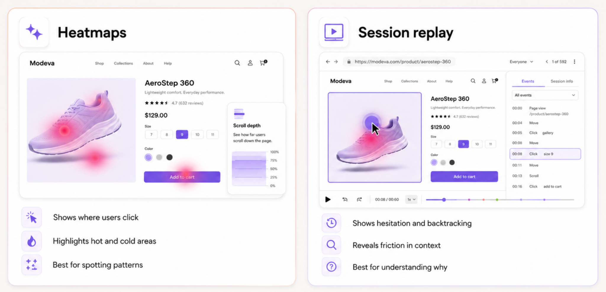
Heatmaps vs session replay: why you need both
Heatmaps help you visualize patterns across many sessions. Session replay lets you inspect selected sessions in detail.
A heatmap can tell you that users click a product image. A recording can show that they are trying to zoom in.
A heatmap can show that people reach a pricing section. A recording can show that they cannot compare plans.
A heatmap can show that visitors abandon a form. A recording can reveal an error message, a frustrating validation rule or a field that does not work on mobile.
LiveSession combines heatmaps, session replay, funnels and segmentation so teams can move from an aggregate pattern to the individual journeys behind it. Instead of watching every recording, filter for the behaviour you need to understand: users who clicked a CTA but did not convert, visitors from a paid campaign, people on a specific device or sessions where an error occurred.
That makes the process more focused and easier to share with product, UX and development teams.
A practical website optimization workflow
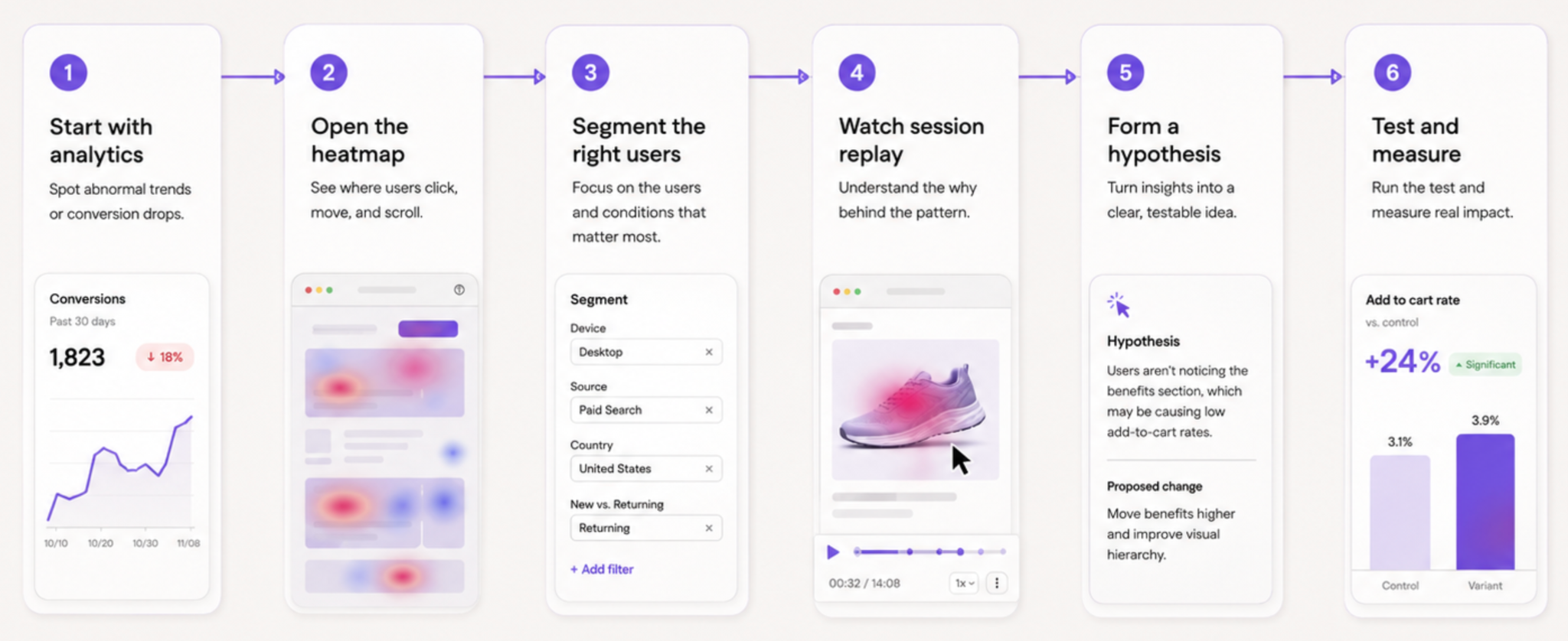
Use this workflow when a page underperforms or a heatmap reveals an unexpected pattern.
Step 1: Start with a business question
Avoid opening heatmaps just to see what looks interesting.
Start with a question such as:
- Why is conversion lower on mobile?
- Why do users click the CTA but leave the form?
- Why does this product page have traffic but few add-to-cart actions?
- Why are people using site search after landing here?
- Why does this onboarding step create drop-off?
A defined question keeps analysis focused.
Step 2: Review page-level analytics
Look at the broader picture first. A website visitor tracking setup gives the page-level context that heatmaps alone cannot provide. Look at the broader picture first.
Depending on your privacy requirements and tracking setup, a cookieless tracking solution can also help you measure visitor behaviour without relying entirely on traditional third-party cookies.
Check traffic source, conversion rate, device mix, exit rate and funnel drop-off. This tells you where the issue appears and which segment deserves attention.
Analytics tools can show that a problem exists. Heatmaps help you see where it might be happening.
Step 3: Use heatmaps to find patterns
Open the relevant click map and scroll map.
Look for unusual activity, ignored sections, hotspots on non-clickable elements, unexpected scrolling or sharp differences between devices.
Write down two or three possible explanations. Do not decide too quickly.
Step 4: Segment the right sessions
Use filters to narrow recordings to the people connected to the pattern.
For example:
- mobile users who reached the form but did not submit
- visitors from a specific paid campaign
- users who clicked a non-clickable element
- users who encountered an error
- returning visitors with high engagement but no conversion
- people who abandoned after viewing pricing
This is where session replay becomes efficient. You do not need to watch random recordings. You need to watch the sessions that can test a specific hypothesis.
Step 5: Watch recordings for context
Look for repeated behavior, not one memorable session.
A single recording can be unusual. Ten recordings with the same pattern are much stronger evidence.
Watch how users interact with the page. Pay attention to pauses, repeated clicking, backtracking, unexpected scrolling and moments where they appear to hesitate.
Then ask: what would make this action easier?
Step 6: Form one testable hypothesis
Keep the hypothesis specific.
Instead of:
The page needs to be clearer.
Write:
Mobile users do not see the pricing summary before the form, so they leave after clicking the CTA. Moving the pricing summary above the form may improve completion.
A clear hypothesis helps the team decide what to change and what to measure.
Step 7: Make one meaningful change
Do not redesign the whole page after one insight.
Change the element connected to the hypothesis. It could be a clearer CTA, a shorter form, visible delivery information, better plan comparison, a working image gallery or a more obvious filter.
Then monitor the impact.
Step 8: Check the result after release
Run the same analysis again.
Did the click pattern change? Did fewer users backtrack? Did the funnel improve? Did the error disappear? Did mobile conversion rise?
Optimization is a cycle. Heatmaps help you spot the next question once the previous one is resolved.
Which heatmap tools should you use?
Heatmap tools vary in depth, setup and the type of analysis they support.
Some tools focus mainly on click and scroll heatmaps. Others combine heatmaps with session replay, funnels, user segments, error tracking, and product analytics.
Hotjar is widely known for heatmaps and feedback tools. It can be useful for teams that need a straightforward way to visualize behavior on a website.
For teams that need more context around complex user journeys, LiveSession brings heatmaps together with session replay, funnels, filters and developer-focused diagnostics. That matters when a click pattern may relate to a technical error, a difficult form or a multi-step product flow.
The right choice depends on what you need to understand. A simple marketing site may need a click map and scroll map. SaaS teams often need a more detailed process for using session recordings to grow a SaaS product. A SaaS product or ecommerce journey may need recordings, funnels and segments to explain why users click but do not convert.
Common mistakes when using heatmaps
Treating a heatmap as proof
Heatmaps provide evidence of activity, not proof of intention.
Always validate important findings with another source, such as session replay, funnel analytics, customer feedback or usability testing.
Looking at too much data at once
A heatmap covering every visitor, device and traffic source can hide useful insight.
Segment by device, page type, campaign source, customer status or conversion behaviour. A pattern that looks weak across all users may be critical for one audience.
Ignoring sample size
A few sessions can create a dramatic-looking heatmap.
Give the tool enough data to reflect real behavior. At the same time, do not wait forever if a critical page clearly shows repeated errors or frustration.
Copying design changes from another site
A hot area on one website does not mean the same layout will work for yours.
Your audience, product, traffic source and conversion goal all shape behavior. Use heatmaps to understand your own users instead of copying someone else’s page.
Optimizing for clicks instead of outcomes
More clicks do not always mean better performance.
A useful change should improve the next step in the journey: form completion, product discovery, checkout progress, trial activation or another meaningful conversion.
Final thoughts
88% of online consumers are less likely to return to a website after a bad user experience. You wouldn’t like your website to be one of them.
Heatmaps are valuable because they turn a large amount of user activity into something you can see quickly.
But they are only the beginning.
Use heatmaps to spot patterns. Use session replay to understand the context. Use funnels and analytics to measure the impact. Then make one change based on a real hypothesis, not a colour on a screen.
That is how heatmaps help teams move from “people clicked here” to “we understand what blocked the next step, and we know what to test next.”
For teams that need to connect heatmap insight with real user journeys, LiveSession brings website behavior, session replay, funnels and technical context into one workflow. You can also compare the broader market in this guide to using heatmap software with other tools.
Related articles



Get Started for Free
Join thousands of product people, building products with a sleek combination of qualitative and quantitative data.